Wednesday, March 30, 2016

Ontario's curtailed wind energy

Ontario's electricity system operator, the IESO, recently released multiple reports including a summary page for 2015's supply now inclusive of "dispatched down" data for industrial wind turbines (in the same format as their 2014 summary). This is the one instance during a year I can compare my estimated curtailment the IESO's reported curtailed wind supply. This year there are similarities, such as the wind curtailments significantly increasing, and there are differences, which I've used to adjust my methodology for estimating hourly curtailments.

The IESO data is not a comprehensive curtailment report. By "curtailment" I mean supply which is rejected by the IESO through any process. My definition includes Ontario Power Generation (OPG) hydro. OPG reports:
During each of 2015 and 2014, OPG lost 3.2 TWh of hydroelectric generation due to SBG [surplus baseload generation] conditions.
For both years, the OPG hydro losses double the amount of curtailment the IESO shows for the combination of "nuclear reductions" and "wind dispatched down."

Thursday, March 10, 2016

The cost of ending coal-fired generation, and renewables, in Ontario

Ontario stopped getting electricity from burning coal at the end of 2013. The coal exit is one element of Ontario's electricity system gathering attention from other jurisdictions, along with a very low greenhouse gas emissions intensity, the fastest growing (and possibly now the highest) rates in continental North America, and a high level of resistance to new generation from local residents. It might be logical for outsiders to associate the steep rise in the price of electricity as the cost of getting off coal, but that has not been the major factor pushing up rates.

Bruce Sharp, an energy analyst I greatly admire, recently produced Ontario Electricity - the Cost of Coal Replacement, which put some numbers up against an Ontario government document on The End of Coal. That document is not the proper starting point for evaluating the cost of ending coal, but Sharp's methodology for pricing provides a useful foundation to build an analysis upon.

table from Bruce Sharp's Ontario Electricity - the Cost of Coal Replacement

4,000 megawatts of wind, and 1,500 of solar, were not part of the plan to replace coal. I've previously demonstrated added natural gas and nuclear generators compensated for the removal of the coal-fired power plants.
Graphic from January 2013 post - data in this spreadsheet
Upon reflection, I think the proper starting point to evaluate the cost of exiting coal is June, 2005 - and it can include some wind. The elimination of coal was a 2002 recommendation of  an "all-party Select Committee on Alternative Fuel Sources", carried in the platforms of the three major parties into the 2003 election. That election was won by the party promising to eliminate coal by 2007 (not 2015 as the all party committee had recommended) - but they weren't succeeding in that goal, so in 2005 they released more specific plans described in this press release:

Friday, February 12, 2016

Eating wind: Carbon capped opportunity Part 2

Reading Rooftop coal: Carbon capped opportunity Part 1 will benefit readers of this post

There's a message being spread about Ontario that the expensive, but low carbon emission, electricity it produces will soon be worth big bucks due to the proposed Clean Power Plan in the United States - and trading of emissions. This was implied by one member of the Climate Action Group on television recently (I wrote on the program), and quickly expanded upon in into an article in The Toronto Star:
... the country’s power sector is prepping for a dramatic increase in U.S. demand for clean electricity.
Action on climate change is the reason — more specifically, U.S. President Barack Obama’s Clean Power Plan, which aims to slash carbon dioxide emissions from power plants by a third by 2030.
The plan is expected to triple the flow of Canadian electricity into Midwestern and northeastern border states, part of a broader U.S. effort to comply with the international climate obligations that 196 countries agreed to in Paris.
...
The North American Electric Reliability Corporation [NERC], which monitors and regulates grid stability in Canada and the U.S., estimated in a report last April that net Canadian electricity exports under the Clean Power Plan could grow three-fold between 2020 and 2030 as demand for renewable power grows in states such as Ohio, Michigan, New York and jurisdictions in New England.
Here we have the agreement from Paris and the U.S. Clean Power Plan discussed, so I'll briefly discuss each to communicate the value for Canada, and particularly Ontario, is limited - but an opportunity does exist.

The most relevant quote for the Paris deal comes from The New York Times' Coral Davenport back in August 2014:
...President Obama’s climate negotiators are devising what they call a “politically binding” deal that would “name and shame” countries into cutting their emissions.
...Countries would be legally required to enact domestic climate change policies — but would voluntarily pledge to specific levels of emissions cuts...
That "name and shame" strategy was advanced in Paris, primarily because the President lacked the ability to have Congress pass anything legally binding. Countries provide plans for reducing emissions, and if they don't achieve them they will be mocked by countries that are achieving their goals, should there be any.

The U.S. Clean Power Plan, if it gets enacted, will offer states a couple of methods to comply with individual emissions targets based on a subset of generators operating in the states in 2012 (I'd need to check in the volumes of text to confirm the base year) - the subset exclude generators without emissions in service prior to 2013 (most notably nuclear); it therefore basically includes almost exclusively emitting facilities.
States can target either emissions intensity, getting facilities to an average of ~20% below the intensity level of the 2012 base year (so replace coal with gas, of augment coal with wind, etc.), or they can just reduce their emissions by the requisite amount (it varies by state). Those sound the same, but the first option could actually see increased emissions. Illinois, for instance, could likely replace older nuclear units with natural gas generators and easily meet clean power plan targets by doing so.
Emissions reductions can come in state or not - by power purchase agreements with facilities outside of the state, or through the trading of cap space (such as through clean energy certificates).

How does this impact Ontario?
___

The North American Electric Reliability Corporation [NERC] reference in the Toronto Star article is probably Potential Reliability Impacts of EPA’s Proposed Clean Power Plan: Phase I, which does show a forecast where:
"Canada exports three times more power to the United States, mainly NPCC and MISO North."
NPCC is the Northeast Power Coordinating Council and it includes Canadian provinces/systems east of Manitoba as well as the New England and New York system operator areas (NYISO and ISONE).

The NPCC jurisdictions don't import much more juice in the NERC work:
graphically edited to most relevant data from NERC "Potential Reliability Impacts of EPA's Proposed Clean Power Plan
The "MW Interchanges No CPP" indicates, for Canada, net exports of 5,461 megawatts on average if the Clean Power Plan doesn't come into force, which works out to an annual total of about 48 terawatt-hours (TWh), and that is the average that actually occurred from 2012-2014. The best case (State level application of the Clean Power Plan) offers an export opportunity into New York and New England systems of another 691 megawatts on average, but that's little more than Ontario wasted in 2014 as generators reportedly curtailed an average of ~550 megawatts (by way of annual totals of 376 thousand MWh of wind, 1.2157 million MWh of nuclear and 3.2 million MWh of hydro-electric power). The NERC document that enthused Tyler Hamilton writing in the Star doesn't offer much hope for the U.S. northeast bailing Ontario out of its over-supply.

Rooftop coal: Carbon capped opportunity Part 1

Big topics are converging as Toronto's spinners, enthused by a new power in Ottawa, work a yarn to justify raising revenue for the government and to gloss over the massive waste in the electricity sector since 2008.
This post is longer than usual, so it is presented in two parts. My intent is to discourage contracting more excess electricity supply in Ontario, and to demonstrate a limited opportunity to steeply reduce losses on existing contracts

Climate change has been called a wicked problem, but that's usually ignored when tidy, if false, solutions get presented.
Two of those solutions are Cap and Trade everywhere, which is of particular interest to Ontarians now, and the U.S. Clean Power Plan -which Ontarians are getting told they might benefit from.

The editorial board of the New York Times has declared Proof That a Price on Carbon Works:
Lawmakers who oppose taking action to lower greenhouse gas emissions by putting a price on carbon often argue that doing so would hurt businesses and consumers. But the energy policies adopted by some American states and Canadian provinces demonstrate that those arguments are simply unfounded.
Around the world, nearly 40 nations, including the 28-member European Union, and many smaller jurisdictions are engaged in some form of carbon pricing. In this hemisphere, British Columbia, Quebec, California and nine Northeastern states have raised the cost of burning fossil fuels without damaging the economy. Alberta, Canada’s biggest oil and gas producer, and Ontario have said they will adopt similar policies.
...British Columbia, which is home to 4.7 million people, has placed the highest price on emissions in North America, taxing a ton of carbon emitted at 30 Canadian dollars, or about $21. By comparison, emission permits in California and Quebec are trading at about $13 a ton. And permits sold for $7.50 a ton in a December auction in the Northeastern trading system known as the Regional Greenhouse Gas Initiative. That system covers emissions from power plants in nine states that include Connecticut, New York and Massachusetts.
These actions deserve applause. But their real value may lie in providing a template for the rest of the world.
The New York Times editorial board is, with one exception, citing actions that have not taken place yet as evidence contrary arguments "are simply unfounded." Is there a topic outside of global warming/greenhouse gas emissions that inspires such intellectual laziness? [1]

Two Cap and Trade initiatives cited in the editorial are the California centred Western Climate Initiative (WCI) and the U.S. northeast's Regional Greenhouse Gas Initiative (RGGI).

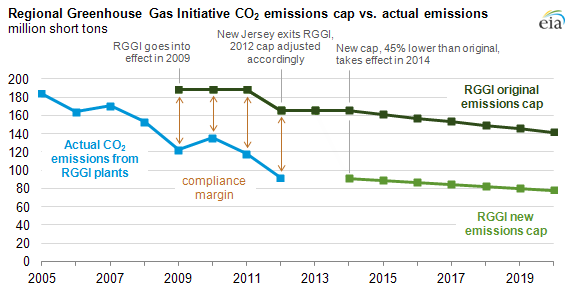
A couple of years ago the U.S. Energy Information Administration (EIA) wrote on the RGGI. From the graphic I guess one could conclude it had been super super great as emissions were far below cap - or one might think the cap was set far too high, particularly if one reflected on why cap space continued to be held by the emitters allocated the emissions allotment (and/or traders), and not sold to somebody wanting to emit.


I thought, examining this graphic, it looked like the new lower cap was still likely to be above "business as usual" emissions, particularly as similar banked credits have been a source of contention in the European Union's Emissions Trading System (EU ETS) - so, on twitter, I asked the EIA, and was politely told who to contact for more information - but I wasn't looking for more information, I was looking for a firm "no", and not receiving one, I was not inspired to pursue study of the RGGI scheme further.

Friday, January 22, 2016

Beyond expectedly high cost: 2015 Ontario Electricity Summary Part 3

During 2015 most Ontario consumers experienced a 12% rise in the commodity price of electricity. The figure is higher than the 8% average annual increase over the past 8 years, but follows the trend of rate increases that was predictable, and if predictions had been heeded properly, largely preventable. In this post I'll note the actions driving the cost of a kilowatt-hour for the common Ontario ratepayer 85% higher over the past 8 years.

In my first post summarizing 2015 figures, I graphed the annual increases in the global adjustment and accompanied declines in the costs recovered through market sales. From 2007 to 2015 the total cost of electricity supply in Ontario grew from around $8.8 billion to $13.7 billion. The move away from recovering costs through market sales is important, but to find the most basic cost drivers we should first find elements of the $4.9 billion supply cost increase, and then explain the rate escalators taking the 55% increase in supply costs to an 85% increase in the supply price for most Ontario ratepayers.

Unexpecting the expected.

If cost increases still surprise some, it must be that the topic is too complicated for most, because clear warnings have existed. Price forecasting took a huge jump in Ontario with Bruce Sharp's August 2010 report prepared for the Canadian Manufactures & Exporters (CME). Prior to the report the price speculation attached to an escalated push into renewables came from the push's instigator, George Smitherman"We anticipate about 1% per year of additional rate increase associated with the [Green Energy and Green Economy Act] bill’s implementation over the next 15 years." [2]  Sharp's August 2010 estimates put the cost much higher - at about $30/megawatt-hour (MWh) for the renewables supply with additional cost for distribution and transmission charges due to the Green Energy and Green Economy Act. The provincial Long-Term Energy plans following Sharp's report seemed to adopt his numbers, and consequently his forecast altered the reality slightly. Nonetheless, 2015's enormous $9.96 billion global adjustment total is only 2% off the total Sharp predicted in a second report 4 years ago.

Up we went

In my second post summarizing 2015 figures I demonstrated my estimates, inclusive of cost for distribution-connected (Dx) supply, largely agreed with the planned expenditures attached to 2013's long-term energy plan. It is important to note the system operator [IESO] current reporting on 2015 totals is only for "supply connected to the high-voltage transmission [Tx] system." The IESO's Tx reporting, as I've previously communicated, provides an increasingly inadequate image of Ontario's electricity generation - and it's encouraging this is being recognized by sector commentators as diverse as Parker Gallant and Tyler Hamilton.
The following graphic demonstrates my estimates of all 2015 generation (including Dx) and related supply costs (including Dx and curtailment):

Calculation exclude other costs included in global adjustment (such as conservation spending". See footnote 1 data.


The IESO's failure to develop reporting on generation from contracted supply within local distribution networks is now missing reporting on about 10% of Ontario's supply costs - mostly attributable to solar panels.

Saturday, January 16, 2016

ignorance shines on solar - and Toronto

Today's blog entry deals with serious data issues - from collection to reporting.

I have other blogs for other purposes: one aggregating articles from elsewhere; another for quick comments, or to work out one aspect of a bigger story, and an edgier blog intended to be meanly funnier in a way that could alienate some readers from my posts here. Today's post will draw on recent material from my other blogs as a petty squabble has reached an interesting data point.

The Toronto Star's Queen's Park columnist, Martin Regg Cohn (MRC), has been working to downplay the recent report from Ontario's Auditor General on the electricity cost impacts of  the province's failure to adhere to the professional Electricity Power System Planning it had designed and introduced.[1] MRC's latest column is titled "Why cheap hydro was too good to be true."

For perspective on the Star's "too good to be true" perspective, one might look at the trend over 50+ years in the country just south of us.


MRC's column today ends with "we can grapple with our electricity reality — a prerequisite to generating better outcomes." Presumably, if one were a grappler, one might look to Q & A for Ontario’s hydro system from the Star's "Queen's Park Bureau Chief Robert Benzie and Queen's Park Bureau reporter Rob Ferguson - but that would be a mistake. Here's their first point:
How is Ontario's Electricity Generated?
The majority of Ontario’s electricity — 60 per cent last year — comes from nuclear reactors at Bruce, Darlington, and Pickering. Almost a quarter — 24 per cent — is from hydro-electricity from places like Niagara Falls, while 10 per cent comes from natural gas-powered generating plants. Only 6 per cent is from wind, and less than 1 per cent comes from solar, with a similar amount of electricity generated by biofuels.
No, that's not so.

Monday, January 4, 2016

2015 Ontario Electricity Data Summary Part 2: component costs, and cost shifting


The electricity sector data widely communicated by the system's operator (the IESO) is increasingly inadequate for analysis of cost and demand trends in the province. This post needs to utilize more obscure data, and the creation of some data through estimates, in order to demonstrate the causes of overall higher prices and the shifting of costs to the smallest consumers of electricity. 2015 continues a trend of rising overall electricity costs, and the increases are amplified by 50% for small consumers.

Consumers can be broadly grouped into three groups: exporters, Class A and Class B. In 2015 a new website appeared that does provide a quarterly report indicating the much different pricing for Class A consumers ("large electricity consumers"), and all other domestic consumers - Class B.
Up to the end of the September the total pricing for the classes was quite different: Class A had averaged $6.24 cents per kilowatt-hour ($62.40/MWh), which was 37% lower than Class B's 9.89 cent/kWh average.

To understand the cost drivers it's useful to first examine the difference between the forms of generation the IESO considers "Ontario Demand", and the metered consumption of Ontario consumers.
The IESO provides, upon requests, figures for "consumption" by the consumer classes defined by the global adjustment mechanism/s. With these figures, and the breakdown of the global adjustment totals by class A and class B published by the IESO, it is possible to recreate the reported average commodity rates. The widely cited "Ontario Demand" refers to demand for supply from transmission connected (Tx) generators. Other generators are connected within distribution grids (Dx). Consumption figures for December won't be available until after the global adjustment totals are finalized in mid-January, but we have enough data to estimate 2015 and demonstrate that over the past 5 years "consumption" in Ontario has gone from being less than "Ontario Demand" to exceeding it.

The change in the the difference between Tx generation ("Ontario Demand") and consumption means that generation is increasing within distribution (Dx) networks. It should be expected that Dx generation data be reported along with Tx data to properly communicate component supply costs.

Sunday, January 3, 2016

2015 Ontario Electricity Data Summary Part 1: the basics

I'm hoping to produce 3 posts for the new year. This one will be more familiar for long time readers as I try to keep it constrained to data that is freely and widely available. A second post will use my estimates of additional data to provide a fuller illustration of that state of Ontario's electricity sector in 2015, and the other will hopefully be more disruptive, connecting data to provincial, national and international events and personalities.

Ontario's simplest electricity data is hourly data from Ontario's electricity system operator (IESO) for demand, imports, exports and Hourly Ontario Energy Price (HOEP). Using only this hourly data annual "Ontario Demand" is indicated as lower than it's been since the market opened in 2002 - and using other data available on the IESO site the demand is lower than it's been for over 2 decades.

Curiosity took me back to a graphic in my first blog post, in 2010, which confirmed it has been a full quarter of a century since Ontario's generators produced less than the 137 million megawatt-hours (MWh) the IESO shows as "Ontario Demand" in 2015.

Ontario Generation is calculated, in the graph above, from the base IESO data as "Ontario Demand" plus "exports" less imports. As that generation exceeded provincial demand by more than ever in 2015, it's not surprising the weighted average market price (HOEP) set a record low at $23.58/MWh.

Record low pricing was accompanied by record high exports. Valued at hourly rates (except when negative after the banning of negative priced exports) revenues from exports look to have been 56% lower than in 2008 - the previous record export volume.