Wednesday, December 5, 2018

Monthly Ontario Electricity data - presented with Tableau

I saw an opportunity for presenting Ontario electricity data in trying out the free public version of the Tab|eau business intelligence tool.

I'm not sure I have the patience, or the smarts, to learn how to do all I've learned with Microsoft's Power BI, but maybe I should. I'm astonished with the power of this map in filtering the data table!

(afraid the attempt at embedding on Wordpress was a failure - but here on Blogger...)

Sunday, November 25, 2018

Smart gift ideas: electricity monitors and hot water

The big deals of the early Christmas shopping season are coming to an end soon, so it’s a little late for advising on purchases, but I have been looking at some product and thought a post on what, and why, might be of interest. Like some - if not many - when I think gifts I think of addressing energy consumption, the new technology of a smarter “internet of things” (IoT), and emissions from energy use. Having served a decade in retail some time ago, I also think of selling as much as buying.

Some background on my electricity consumption history. Our current home uses much less electricity than it did when we arrived a decade-and-a-half ago. I wrote on the house early in 2015 after we’d received natural gas and installed a forced-air furnace and my beloved gas stove.

A quick narrative for the chart: from 2004 to 2007 the living space grew considerably (30+%) - efficiency improved although consumption doesn’t show it. Then the wood stove years began (about 3 full cords a years) and more of the house was renovated/insulated. At the end of 2014 gas arrives (we consume 1000-1100 cubic meters a year), and wood consumption is halved. The blip up in 2017 was due to a project by another member of the household (quite a productive one), which ended early this year and consumption is falling back accordingly. Electricity consumption is above the average for Ontario homes, but there may be very few homes at that average as those that heat water with electricity (as I do) are likely above average, and others probably below.

And then there’s cost.

Monday, November 12, 2018

Trends in Ontario Electricity rates by Consumer Segments


The graphic illustrating trends in electricity pricing in Ontario will be more impactful with some explanation. First I'll deal with the terminology housekeeping, allowing for some discussion of the trends.

Definitions/Terminology

  • Regulated Price Plan (RPP) consumers are most residential and small business consumers whose rates are set by the Ontario Energy Board (OEB), essentially on a forecast of supply costs over the next 12 months;
  • Class B consumers pay the flow-through cost of supply on their monthly bills (although usually as an estimate);
  • Class A consumers were the very largest consumers in the province - as of 2011 they could lower their bills by lowering their consumption during 5 peak hours;
  • Exporters pay only a real-time market price (RTP) for supply.
The Class A commodity rate is calculated as the statistical average Hourly Ontario Energy Price (HOEP) plus the average global adjustment for the class (total Class A charges divided by consumption). The Class B commodity rate is calculated as the weighted average HOEP plus the average global adjustment rate for the class. The global adjustment in my estimates differs slightly from figures reported by the IESO as global adjustment figures are publicly disclosed at gigawatt-hour level (GWh), while I expect the IESO calculated at a finer level of detail.

Exporters do not pay the global adjustment, and they settle at the real-time price (RTP) for particular jurisdictional interties, not the HOEP. As I only have RTP data from 2010 on, the figures from 2005 to 2010 are based on the HOEP which effectively underestimates the average cost. From other data (including this) it is known the actual average intertie-specific RTP value realized on exports was about 10% higher than the HOEP value during those years.


Two average rates are shown: the average for Class A and B (or, prior to the introduction of the classes in 2011, simply the Ontario average) is shown as the "Average Ontario Commodity Rate", and the "Average Commodity Rate" which also includes exports. Those averages are all weighted according to the consumption of each consumer class. Notably, RPP rates are not in the average calculations (as they should simply be a different type of Class B rate).

Discussion and Analysis

Sunday, October 28, 2018

Saving TransAlta: a demonstration of Canada's Clumsy Carbon Pricing

Canada’s Prime Minister announced aspects of a carbon pricing policy again last week. This time there were some details on how much more people in four provinces would pay for fossil fuels, the estimated revenues from those charges, and what is to be done with those revenues. Subsequently there’s much commentary on the content of announcement, and I’ll offer some more, but my attention was returned to a topic I prepared to write on quite some time ago: the impact of government actions in Alberta on a company owning much of the coal-fired generation in its province. I’ll use that company to demonstrate why I refer to the allegedly national policy as Canada’s Clumsy Carbon Pricing (CCCP).

The government’s website contains a section on “Ontario and pollution pricing[sic] that describes the two main aspects of CCCP:
The federal carbon-pollution [sic] pricing system will be implemented in Ontario, under the federal Greenhouse Gas Pollution Pricing Act with the following features:
  • For larger industrial facilities, an output-based pricing system for emissions-intensive trade-exposed industries will start applying in January 2019....
  • A charge applied to fossil fuels, generally paid by registered distributors (fuel producers and distributors), as set out in the Greenhouse Gas Pollution Pricing Act, Part 1, will start applying in April 2019…
Because the 2019 pricing for provinces not deemed to have met federal pricing requirements is only now being finalized it will not be effective January 1st, but April 1st, while the Output Based Allocations (OBAs) that are still not finalized are still to be effective four months prior to that - on January 1st.

Clumsy - at best.

Sunday, August 12, 2018

Carbon Con: It's only economics

part 2 in a series imagining the participants at a 'Comic Con' like convention for reducing greenhouse gas emissions. The first post was ECO communication
"Assume I'm an economist..."

Way back when I began the second post to this blog with that ask. Over seven subsequent years of research, data analysis and communicating on electricity supply, emissions, and markets, I've since revised my perspective.
A man walks into a Doctor's office and says, "Doc, it hurts all over when I do this."
The doctor prescribes of a Pigouvian tax.
graph from Wikipedia 
In an April blog post I hinted at my envy of those utilizing richer media tools - from richer graphics to audio/podcasts to video. At that time a group called the EcoFiscal Commission had just released, on their attractive website, "Clearing the Air: How carbon pricing helps Canada fight climate change." A beautifully formatted .pdf provided more depth than the web page, and all were accompanied by short video explainers. The work features 3 case studies of jurisdictions with pricing of greenhouse gas emissions - only 1 of which has significantly reduced emissions. I was going to focus on these case studies but they're really a footnote to addressing a bigger issue, enunciated by in a video clip Ecofiscal Chair Chris Ragan:


"Canadians do care about climate change but they also care about the economy... until Canadians are presented with a solution that makes sense for both the environment and the economy they are not going to put this at the top of their list.
Carbon pricing is that solution."

As they say outside the hallowed halls, "to a hammer everything looks like a nail."

I am going to rebut the evidence supporting the "Carbon pricing is that solution" claim, while recognizing why there could be roles for economists to play following the introduction of The Paris Agreement.

I realize a credibility gap probably exists as the Ecofiscal Commission is stacked with prominent names whereas I am known by far fewer and often as an opponent of "green" energy - and/or a proponent of nuclear energy. To encourage reading on I'll note Ontario has greatly lowered its emissions since I began blogging - a fact which need not be credited to me to any extent, but it also has much less generating capacity from "green" energy, and more from nuclear, than was planned at when I started arguing for retaining nuclear and halting the wind and solar subsidies.[1] Certainly many names from Ecofiscal are recognizable, but I recognized none as being active and influential where emissions have been significantly reduced.

Saturday, August 4, 2018

Ontario's rotten wind era at its end

There are three stories from recent news indicating the poverty of competence in Ontario's industrial wind turbine tale. Two occur in bucolic counties near the eastern end of Lake Ontario, the other just south of the forest fire burning in French River Provincial Park - where the fire originated. Most discussion of industrial wind in Ontario is delivered in a narrative of good (renewables) and NIMBY (not in my backyard). Occasionally somebody wades in pretending there's a business angle, so I thought I'd rebut that ignorant assessment while commenting on the three recent wind stories.

The foundation for the post has to be a little dry.

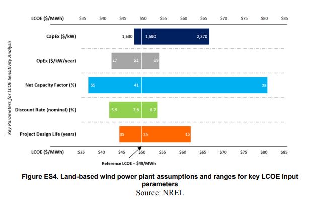
The world of cost estimates for electricity is complex, but it's not hard to understand the capital expenditure (CapEx) per Watt of generating capacity is important element. This excellent graphic, from the respected National Renewable Energy Laboratory (NREL) 2016 Cost of Wind Energy Review, puts CapEx at the top of its cost parameters stack


At today's currency values the U.S. report's $1530-$2370/kW range equates to a $2000-$3100 in Canadian dollars.

The NREL report builds on figures from the U.S. Department of Energy 2016 Wind Technologies Market Report. Drilling into some numbers shared for that report reveals most projects were built with CapEx below $1800USD/kW ($2360CDN/kW), and that in real dollars that $2360CDN/kW is an above average cost over the past 20 years.


It is also notable that the highest pricing of the past 2 decades, per Watt of capacity, occurred about the time (2009-10) Premier Dalton McGuinty introduced Ontario's lucrative feed-in tariff contract mechanism - or perhaps it would be more correct to say Ontario's Premier introduced Germany's feed-in tariff contracts to Ontario.

The International Renewable Energy Ageny (IRENA) Renewable Power Generation Costs in 2017 report agrees with NREL's figures, and notes similar 2016 weighted average pricing for onshore wind in North America, Europe, South America (excluding Brazil), and Eurasia. Call it $2,400 Canadian per kilowatt of onshore industrial wind turbine (IWT) capacity.


This background on capital expenditures (CapEx) in constructing industrial wind turbine projects provides a basis for analyzing 3 Ontario projects that have recently been in the province's news.

Sunday, June 17, 2018

Ontario Electricity: Backgrounder and suggestions for Premier Ford

Ontario has a new Premier. Congratulations to Doug Ford who, despite my recent quiet, is receiving a lot of free advice on addressing costs in Ontario's electricity. Some of it good, but much of it not only bad, but based on flawed views of how Ontario's residential and small business consumers came to experience rapid rate growth.[2] I also have noted some advice - from academics - is oblivious to the new political reality of Ontario. Before getting into thoughts on controlling electricity costs, I'll provide my perspective on the politics of the situations that will determine which suggestions are actionable.

I wrote very little in the run-up to the election because it struck me as a race to the bottom. I used to write on things that angered me (to some extent), and then I'd hope to edit out my annoyance based on, "Nobody cares that I'm angry. What is my point?" This election the point seemed to be people were beyond angry with Kathleen Wynne. I'd call it disgusted. There's a saying in politics that "anger is not sustainable." That's probably true but around the time her government was introducing the ridiculous [un]Fair Hydro Plan I'd wondered if the Wynne policy team had let the anger of the first half of her mandate develop into disgust. Disgust is not an emotion, it's a sense. I was curious to see if I was wrong, and a climb up in the polls was possible for Premier Wynne. I don't think I was wrong - I do think the election was about this sense of disgust, and I found it so unpleasant I voted in the first hour of advanced polling and then tried to ignore it altogether.

I realize many of the angriest were people who follow my blog and know about the Liberal party's enormously wasteful performance in the electricity sector. The waste cost most Ontarians money, but not food, or housing, or heating. With the election over, and the previous governing party embarrassed by failing to win enough seats for official party status, I am hoping many will start the new era of Ford's rule by editing out their anger and trying to find their point. This is not a kumbaya moment though. A real cost reduction of the scope promised by incoming Premier Ford will require tough choices harming real people and angering numerous constituencies, but particularly the one known in the electricity sector as "stakeholders."

Political Constraints

The political reality of the election is pricing carbon is dead: Doug Ford took the leadership in the race for leading the Progressive Conservatives by opposing the recently implemented current cap-and-trade system in Ontario and the federal government's demand province's implement some regime. I'll try to avoid the topic - and fail (but hopefully only once).

Functional Constraints

Ontario's electricity, if mine is any indication, is pretty reliable (the lights stay on) and it is exceptionally clean, with very low emissions of greenhouse gases. My views on what can be done to control costs is influenced by two concerns that I don't see noted very often:
  • capacity
  • industrial electricity costs

Monday, April 16, 2018

Carbon-Con: ECO communication

A couple of weeks I was asked about potential ways to collaborate with reputable sites. I put some thought into that before responding that simply an association with me could bring a site to disrepute, but my thoughts on communication persist. From the belligerent uttering of a federal Minister on a Sunday talk show, to a media blitz from an organization marketing itself as expert on economic tools to reduce carbon emissions, to the Ontario report I'll feature in this commentary, it's been as if a convention of climate change alarm is occurring.

A Climate convention.

Comic Con (short for convention) is a really big event now, which makes some sense in this era of communication. Text is a low impact medium - the sites adding audio and video, integrating with podcasts, have a huge advantage. As the comic and related genres (science fiction, fantasy and superhero) grew from print to screens of all sizes, the graphics and sound growth has simply piled success onto success. The term "simply" recognized almost all characters can be grouped into good or bad.

Perhaps due only to my musing about communication, collaboration and branding, I thought the polarized nature of climate, and energy discussions, make Comic Con a model for communication and promotion in the 'clean tech' industry.

I'd prefer to be a hero, but realize the model needs villains too.

What I hope will be found in my little section of this Carbon Con is data-driven iconoclasm delivered through research, competent data handling, pointed if not visually appealing graphics, and full contact criticism of those blissfully unaware they deserve to be blisteringly opposed.

What many will find is villainy - I've been accused as anti-wind, anti-renewable, anti-conservation, pro-nuclear, disrespect and misogyny. I don't agree with that entire list, but I'm okay with being the villain if it makes for better heroes.

My concern with the profession of professing concern about carbon emissions begins, as most things do, with religion.

Monday, April 9, 2018

Base load and baseload generation

The term baseload gets thrown around frequently but seldom is associated with a base, or minimum, load. It occurs to me the level of knowledge in discussions on electricity supply could benefit from reviewing the level of total electricity that would be met by a mythical generator running throughout at a the year at the minimum system demand. The results are not surprising,but the current level of discourse indicates the results are not intuitive.

I’ve revisited hourly load data I’ve collected over the past year for two provinces and British Columbia (bce … or BC). Each data set measures “load”, or demand, differently, but the particulars are not important for this simple review. For each province’s data set, I’ve queried the minimum annual load along with the average. Upon reflection it’s obvious that the minimum load divided by the average load produced the percentage of annual supply that could come from the steady production of the minimum load.


Differences between years are minimal, but the difference between Alberta and the other 2 provinces is significant. Alberta’s flat load profile means 80% of annual generation could usually be met by consistent supply at the base load level. “Alberta Internal Load”, or AIL, is the statistic used, and it includes behind-the-fence generation which is large due to extensive cogeneration, particularly from oil sands operations. Large industrial loads tend to be far more consistent than, particularly, residential demands. In Ontario and BC the reported loads, which omit behind-the-fence generation, indicate over 2/3rd of supply requirements would be met by output at the base load level.

For reasons I’ll return to in discussing implication of this base load supply level review, I ran some figures estimating how much usable supply would come from increasing the base supply level to 10% above the annual base load level, and with base supply 20% above base load.

Monday, March 5, 2018

Transmission constraining Ontario's Niagara Hydroelectric potential

I was recently asked why I claim there are transmission constraints on electricity generation from Ontario Power Generation (OPG) Niagara river system generators.

I’ve written a number of times on production levels and argued the constraints largely because I have consistently found the actual output from OPG’s 5 Niagara system generators less than it could be. There are current reasons to revisit the issue:
  • In 2017 the total was 11.32 TWh[1], which is probably the lowest level since I first appeared, in 1965,
  • OPG reported 4.5 TWh of "forgone hydroelectric generation" due to surplus baseload generation (SBG) in the first 9 months of 2017, up 15% from 2016 when OPG's annual foregone generation was 4.7 TWh, 
  • OPG intends on adding 106 megawatts of capacity through an overhaul of  two idled old units at the Sir Adam Beck I Generating Station
I’ll review the annual generation data but acknowledge the lowered generation doesn’t prove a transmission constraint - so I’ll also build a timeline demonstrating increased transmission was deemed necessary a decade ago, and the need must have grown significantly, along with generating capacity in the region, since then.

My curiousity on the topic of foregone generation was piqued in June 2011 by an article in the Buffalo News.[2] The article discussed Canada’s inability to utilize all the water it had rights to in generating electricity on the Niagara river, and OPG's Niagara Tunnel project that was to address that, increasing generation by 1.6 TWh. In March 2013 the tunnel was declared, by OPG, to be in-service.

By 2014 I was utilizing Hourly Generator Output and Capability reporting from Ontario’s system operator (IESO) to collect data on individual generators[3], and U.S. Energy Information Administration (form EIA-923) data for the generators on the U.S. side. The comparisons showed OPG output falling far behind the U.S. generation on the Niagara river[4] - a trend which has since, surprisingly, accelerated.


When the output at OPG’s generators did not increase after the Niagara tunnel project completion, I looked for other causes.

Thursday, March 1, 2018

Review of 2017 electricity supply in Ontario

You purchase a  full 9-unit container of energy .
The 3 men who deliver it pour out 2 units out while lecturing on consumption. 
They imply you should make more yourself as they leave.

A couple of months have passed since I last posted to the blog. This may be due to writer's block, or a lack of ambition - or maybe I was wisely waiting until I had something nice to say!

With growing knowledge, and curiosity, I seem to muddle all little issues into the broad themes I deem important - and not only for energy. In this post I'll touch on metrics from 2017 the reader may be looking to this blog to find, with hopes of connecting the data to bigger issues.

There are many possible headlines from an annual analysis:
  • electricity "demand", as reported by the system operator was down, to levels not seen in decades
  • supply generated from fossil fuels (natural gas) was sharply down too, and again to levels probably not seen in over over half a century
  • prices for consumers on regulated price plans were sharply down in 2017 due to legislation and consequent debt (the [un]Fair Power Plan), but,
  • total costs for supply declined in 2017, although average unit cost was up slightly (as demand declined more)
  • nuclear supply was down as one unit (Darlington 2) was out of service for the entire year due to refurbishment, but the units remaining online largely took up the slack as Bruce Power had record output, as did the set of 9 units at Ontario Power Generation which operated during 2017, and
  • for the first year since the system operator reported on their system's wind output, in 2006, it reported a decline (albeit a very slight one)
I didn't wish to dwell on numbers in this post. During 2017 I learned some new data reporting tools which I put on on a site where I invite data-gluttons to learn the filters and views to generate the typical year-end summary statistics, such as the total annual biomass generation for the past decade.
I do wish, in this post, to combine commentary to statistics to demonstrate very good figures from one perspective can have bad implications from a broader perspective. This is particularly important to note as the reasons rates didn't rise sharply in 2017 aren't sustainable.