Saturday, January 16, 2016

ignorance shines on solar - and Toronto

Today's blog entry deals with serious data issues - from collection to reporting.

I have other blogs for other purposes: one aggregating articles from elsewhere; another for quick comments, or to work out one aspect of a bigger story, and an edgier blog intended to be meanly funnier in a way that could alienate some readers from my posts here. Today's post will draw on recent material from my other blogs as a petty squabble has reached an interesting data point.

The Toronto Star's Queen's Park columnist, Martin Regg Cohn (MRC), has been working to downplay the recent report from Ontario's Auditor General on the electricity cost impacts of  the province's failure to adhere to the professional Electricity Power System Planning it had designed and introduced.[1] MRC's latest column is titled "Why cheap hydro was too good to be true."

For perspective on the Star's "too good to be true" perspective, one might look at the trend over 50+ years in the country just south of us.


MRC's column today ends with "we can grapple with our electricity reality — a prerequisite to generating better outcomes." Presumably, if one were a grappler, one might look to Q & A for Ontario’s hydro system from the Star's "Queen's Park Bureau Chief Robert Benzie and Queen's Park Bureau reporter Rob Ferguson - but that would be a mistake. Here's their first point:
How is Ontario's Electricity Generated?
The majority of Ontario’s electricity — 60 per cent last year — comes from nuclear reactors at Bruce, Darlington, and Pickering. Almost a quarter — 24 per cent — is from hydro-electricity from places like Niagara Falls, while 10 per cent comes from natural gas-powered generating plants. Only 6 per cent is from wind, and less than 1 per cent comes from solar, with a similar amount of electricity generated by biofuels.
No, that's not so.

Monday, January 4, 2016

2015 Ontario Electricity Data Summary Part 2: component costs, and cost shifting


The electricity sector data widely communicated by the system's operator (the IESO) is increasingly inadequate for analysis of cost and demand trends in the province. This post needs to utilize more obscure data, and the creation of some data through estimates, in order to demonstrate the causes of overall higher prices and the shifting of costs to the smallest consumers of electricity. 2015 continues a trend of rising overall electricity costs, and the increases are amplified by 50% for small consumers.

Consumers can be broadly grouped into three groups: exporters, Class A and Class B. In 2015 a new website appeared that does provide a quarterly report indicating the much different pricing for Class A consumers ("large electricity consumers"), and all other domestic consumers - Class B.
Up to the end of the September the total pricing for the classes was quite different: Class A had averaged $6.24 cents per kilowatt-hour ($62.40/MWh), which was 37% lower than Class B's 9.89 cent/kWh average.

To understand the cost drivers it's useful to first examine the difference between the forms of generation the IESO considers "Ontario Demand", and the metered consumption of Ontario consumers.
The IESO provides, upon requests, figures for "consumption" by the consumer classes defined by the global adjustment mechanism/s. With these figures, and the breakdown of the global adjustment totals by class A and class B published by the IESO, it is possible to recreate the reported average commodity rates. The widely cited "Ontario Demand" refers to demand for supply from transmission connected (Tx) generators. Other generators are connected within distribution grids (Dx). Consumption figures for December won't be available until after the global adjustment totals are finalized in mid-January, but we have enough data to estimate 2015 and demonstrate that over the past 5 years "consumption" in Ontario has gone from being less than "Ontario Demand" to exceeding it.

The change in the the difference between Tx generation ("Ontario Demand") and consumption means that generation is increasing within distribution (Dx) networks. It should be expected that Dx generation data be reported along with Tx data to properly communicate component supply costs.

Sunday, January 3, 2016

2015 Ontario Electricity Data Summary Part 1: the basics

I'm hoping to produce 3 posts for the new year. This one will be more familiar for long time readers as I try to keep it constrained to data that is freely and widely available. A second post will use my estimates of additional data to provide a fuller illustration of that state of Ontario's electricity sector in 2015, and the other will hopefully be more disruptive, connecting data to provincial, national and international events and personalities.

Ontario's simplest electricity data is hourly data from Ontario's electricity system operator (IESO) for demand, imports, exports and Hourly Ontario Energy Price (HOEP). Using only this hourly data annual "Ontario Demand" is indicated as lower than it's been since the market opened in 2002 - and using other data available on the IESO site the demand is lower than it's been for over 2 decades.

Curiosity took me back to a graphic in my first blog post, in 2010, which confirmed it has been a full quarter of a century since Ontario's generators produced less than the 137 million megawatt-hours (MWh) the IESO shows as "Ontario Demand" in 2015.

Ontario Generation is calculated, in the graph above, from the base IESO data as "Ontario Demand" plus "exports" less imports. As that generation exceeded provincial demand by more than ever in 2015, it's not surprising the weighted average market price (HOEP) set a record low at $23.58/MWh.

Record low pricing was accompanied by record high exports. Valued at hourly rates (except when negative after the banning of negative priced exports) revenues from exports look to have been 56% lower than in 2008 - the previous record export volume.

Thursday, December 17, 2015

Losing time: everybody can't win Ontario's Electricity game

November's main electricity commodity rate in Ontario averaged $123.54/MWh, a full 10% higher than the previous record price. This post examines why.

Demand in November was very low, but almost identical to demand the previous month. The main electricity rate in Ontario is the Class B commodity rate comprised of the weighted Hourly Ontario Energy Price (HOEP) and the Class B global adjustment rate. It rose 23% from October to November. This makes a comparison of October and November very compelling.

The rate was the highest because data shows Ontario spent more on generation, and whatever else the system's operators felt related to generation, than any previous month.

There's been a lot of words about Ontario's electricity costs following the latest annual report from the Auditor General of Ontario, most from men in Ontario's electricity establishment claiming the female Auditor was unfair in noting the growth of the global adjustment. Today I am looking at the global adjustment only to estimate the total spend on electricity generation - and whatever else the system's mandarins feel is related to electricity generation - each month.


The graph's message is clear: total supply cost is rising. In November, Ontario spent more on electricity supply than ever before, despite demand levels near lows. Note the chart runs 49 months: November 2015 total supply cost is 53% higher than November 2011, while "Ontario Demand", as defined by the IESO, is down.[1] I don't want to dismiss the fact the price increase is seen entirely as a rise in the global adjustment, as that has very important cost implications in distributing system costs disproportionately across consumer segments. One result of growth entirely being in the global adjustment is the rise in the main, Class B, commodity rate is 77% over the 49 months - 24% higher than the increase in total systemic supply costs.

Why did the system's costs rise $240 million from October to November?

Wednesday, December 2, 2015

Don't believe happy presentations of Ontario's renewables pain

In January Ontario's government is introducing a new price support program to help poorer households with electricity costs. The planning for the program reveals an expectation that 1 in 10 Ontario households can not longer bear rising electricity rates.

I am inspired to write by two events of November 30th:
  1. Ontario's electricity system mandarins released an astronomical estimate indicating November rates will be 20% higher than ever before.
  2. CBC's flagship news program broadcast a poorly researched segment, "Canada's clean energy race."
Examining the Samsung numbers for high-priced November might provide a simple explanation of what the global adjustment is, but some background is necessary to judge the value Samsung has delivered.


Chris Brown's CBC report included segments interviewing Tim Smitheman, once a public servant, now an employee of Korea's Samsung further aiding that company in siphoning money out of Ontario. Brown celebrated Samsung, but any investigation would have revealed he could not have picked a better subject to display the failure of Ontario's green energy foibles.

A brief history lesson is necessary to communicate how poorly Samsung has performed for Ontario. In 2008-09, Minister of Energy George Smitherman and his boss Dalton McGuinty wanted to make a big splash to kick off the glorious renewables future German politicians and David Suzuki had convinced them was imminent. In January 2010 the government inked a deal with a Korean Consortium that included Korea's electricity experts, KEPCO (since departed the Consortium), and Samsung. The deal"would see the consortium receive preferential treatment from the province, in the form of priority access to the energy grid and higher-than-market rates for the renewable energy it creates as part of Ontario’s new feed-in-tariff (FIT) program." 
“It’s now a race to see which clean technologies will dominate, and wind and solar are off to a strong start” - Chris Brown, CBC, November 30, 2015
The Samsung deal has been a disaster. Hopes that expertise in LCD displays would lead to breakthroughs in solar panel manufacturing tech Samsung would base in Toronto disappeared, as did hopes expertise in shipbuilding would translate to breakthroughs in wind turbine design to be based in Ontario.
All those things were sub-contracted out.

Tuesday, November 17, 2015

New report numbers the IESO days, shows wind impacting Ontario rates

A new report on Ontario's daily electricity sector demonstrates the shortcoming of reporting of the sector's costs that contributes to the poverty of intellect in much too common communication on the sector.

The new report is from me, and it is to provide consumers, and other critics, with a more intelligent summary than the little noticed "Daily Market Summary" produced by the province's system operator (IESO). I hope some readers will work through the additional numbers as they can demonstrate the broad themes driving pricing in Ontario - and if some that do the work join a chorus calling for some transparency and meaningful reporting from the IESO,  my work in creating the reporting will be somewhat justified.

If one were to have no other information than the IESO Daily Market Summary reports for November 10th, and 12th, they'd think a little less demand - 187 megawatt-hours (MWh) - resulted in the price dropping $27.59/MWh to essentially free.

Ontario's demand for electricity did not change. The IESO's "demand" is not Ontario's consumption, but the demand for supply from generators in the IESO's market.

There are qualitative issues with the IESO report.
The HOEP price is the Hourly Ontario Energy Price. The weighted average is arrived at using hourly "Ontario Demand" and hourly HOEP - if one wanted to competently establish the "Value of Market Demand" they would not do it as the IESO does in this report. The weighted average price of exports has always been different, but since the IESO prohibited negative-priced exports the difference can be enormous.

Beyond the qualitative issues with the IESO's report is the absence of any attempt at costing the procured supply (their "demand"). With the global adjustment mechanism driving prices, this renders the report essentially worthless

Monday, November 9, 2015

A line and the race for expensive Electricity

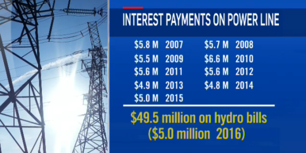
"Powerline to nowhere: $100M powerline costing taxpayers millions" was a provocative title for a CTV news story last week. The network reported their investigation indicated a transmission line without transmission wires wasn't transmissioning electricity, which didn't surprise me - what did surprise me is the video segment on the report implied "it had never been needed at all." The reality is far different than CTV's viewers would understand: the inability to "Install two new 230 kV circuits between Allanburg TS and Middleport TS" to "Increase import capability on Queenston Flow West," has cost many, many times more than the $50 million reported by CTV.[1]


The line was built to improve transmission to the Niagara area partly designed to complete in time to support increased capacity at the Beck generating stations of Ontario Power Generation (OPG). The completion of a $1.5 billion tunnel project  was to get more water to turbines, with an estimated increase in power generation of 1.6 terawatt-hours (TWh). The primary reason given by Hydro One, in 2005, for the "Niagara Reinforcement - Transmission Line Project was, "Facilitate new generation development in the Niagara Falls area." [2]

The need for that was apparent to all who read the Buffalo New in 2011, as it reported on the international agreement regulating the water usage from the Niagara river. Prior to the completion of the tunnel OPG was unable to utilize their full allotment of water for power generation and an agreement allowed the U.S. side to generate power with the unused quota.

Monday, November 2, 2015

October revealed flaws in Ontario's rate and electricity market designs

October 2015 provided a unique opportunity for analysis of Ontario's electricity supply system as the Darlington nuclear power station was unproductive due to a planned vacuum building outage. During the previous October Darlington generated 2.5 million megawatt-hours (MWh) of electricity, which was 23% of what the province consumed during the month. 2015's October therefore provides a glimpse of what Ontario's sector will be like in a few years, as the Clarington Transformer Station is completed and Pickering Nuclear Generating Station is closed.

Vacuum building outages are scheduled for the lowest demand periods of the year, and October is one of those month. October 2014 saw a glut of power and concluded with a $1+ billion estimate of the global adjustment (the difference between what the system pays suppliers and what is recovered through the sale of power at market prices). With the rise of solar (largely unreported in the province) Ontario regularly exceeded $900 million during the sunnier months of this year's second quarter, but 12 months ago $1 billion was a stunning, unprecedented number. Parker Gallant and I published an analysis of 2014's October noting:

  • the record high global adjustment total
  • the record global adjustment rate for the 90% of consumption that can be considered "Class B"
  • the record low Hourly Ontario Energy Price (HOEP) the market determined
  • the record low price for exports
  • the high level of curtailed generation (contracted supply the system could not take)
  • record supply from wind and solar generators.
Figure from IESO June 2015 18-Month Forecast
Ontario's system operator, the IESO, would include a graph of curtailments in June 2015 that showed Parker and I were close, if a little enthusiastic, in this claim:
During October, 2014, the IESO curtailed more than 500,000 MWh of production. While wind power accounted for 100,000 MWh directly, much curtailment at nuclear and non-utility generators (NUGs) and import cuts occurred due to bloated supply levels during periods of windy weather. If one combines the curtailed production with the exports for October, it is obvious that Ontario dumped more than 21% of the province’s procured (and paid-for) supply
October 2014 exports totaled 1.8 million MWh, dumped at an average price of about half of one cent per kilowatt-hour ($5/MWh). The 2.3 million MWh total, from exports sold at an enormous loss and supply simply curtailed, is only slightly off the 2.5 million MWh reduction in Darlington's production the following October. Ontario's demand was little changed from 2014's October to 2015's.[1]

It might surprise readers that much of Darlington's missing generation was replaced with generation from other sources, as exports dropped only 300 thousand MWh.