Showing posts with label Global Adjustment (GA). Show all posts

Saturday, October 22, 2022

Ontario Residential Electricity Rates are dropping. Bills aren't.

The Ontario Energy Board (OEB) released Regulated Price Plan (RPP) rates for the next 12 months, and they're down 10% from the current period. Other changes were not as clear from the material published along with the new rates, which I've come to realize is necessary for residential consumers to understand that their bills will change very little. I was waiting to see what the mainstream media would publish regarding the steep, and internationally rather unique, decline in rates, but I've seen nothing - which is somewhat of a blessing given the poverty of understanding demonstrated in recent reporting on Ontario electricity. I'll explain what is happening to rates, why they're dropping for one category of consumer, why it won't change individuals' bills, and the impact on other categories of consumers from recent changes in the so-called market's pricing.

I've added summary columns to the OEB's presentation of rate changes in the following tables, to demonstrate the reduction is rates. For those hoping to find information of which rate plan is best for them I'll point to my work 2 years ago as there's no real change in the mechanics: if your usage is primarily in the lower threshold of the tiered pricing plan, use that plan - if it's mostly in the upper tier, stay with the default time-of-use (TOU) rate plan.

Tuesday, August 18, 2020

Messages from July's Global Adjustment figures

Ontario's electricity system operator (IESO) released the final July global adjustment figures yesterday. July is the first month of new global adjustment "Peak Demand Factors" for participants in the Industrial Conservation Initiative (ICI), and therefore it's the month that gives an idea how severe the cost shifting from the Class A consumers participating in the ICI to the other consumers in Ontario (Class B).

"To B." - Ontario electricity rate designer.

Collectively class A consumers share of the global adjustment costs shrunk to 16.7% from 17.7%, which had shrunk from 19.2% the previous adjustment period. From July 2019 thru June 2020 the shrunk share for Class A meant $215 million more transferred to Class B consumers - or the taxpayer that subsidize them - and that will increase by about $150 million a year for the next 2 years due to the Ford government's decision to suspend the requirement to reduce consumption during peak periods during the current adjustment period.

Some good news from the global adjustment reporting is Class A consumption is continuing to recover since sharply dropping towards the end of March

Tuesday, January 7, 2020

Review of Annual Ontario Electricity Data

It's that time of year. This will be the tenth time I've produced a post on year-end electricity data. In my first such post I quoted the IESO's release on data for 2010:
"The cost of power in 2010 was 6.52 cents per kilowatt hour (kWh), as compared to 6.22 cents/kWh in 2009. This cost includes the average weighted wholesale market price of 3.79 cents/kWh and the average Global Adjustment of 2.73 cents/kWh (preliminary)."
It's a little higher than that this year. A similar sentence for 2019:
The [class B] cost of power in 2019 was 12.63 cents per kilowatt hour (kWh), as compared to 11.51 cents/kWh in 2018. This cost includes the average weighted wholesale market price of 1.8 cents/kWh and the average Global Adjustment of 10.8 cents/kWh (preliminary).
The prices aren't strictly comparable for two reasons, but for most consumers the difference will still be significant.
The numbers are nominal, but there was little inflation in Ontario over the decade (approx. 18%, and 1.85% in 2019) so the real "cost of power increase" for most consumers was still 65% over the decade, and 7.8% last year, which means last year was worse than average!
The "class B" distinction is necessary as two - or three - distinct consumer classes were created over the past 10 years.

I'll look at three distinct areas of supply: the reported generation figures on the IESO-controlled grid (ICG), distributed generation, and curtailed generation (which is supply Ontarians will pay for but was not accepted onto the ICG). I'll look at costs by the fuel, or supply type, as the IESO reports for generation. I'll look at "the cost of power" by consumer groupings, and provide an average cost of power. Most of these figures are estimated, and even figures produced by the IESO will often differ from one another due to minor differences in the origin of the data.
I will not generally try to reconcile my estimates to figures reported by the IESO due to limiting my time - and not agreeing with the IESO on discrepancies I've found in the past. Please interpret numbers as illustrative, and not gospel. This should be particularly obvious for cost break-downs which are not available anywhere else: most contracts are private and rates are estimated as best I can. I will briefly discuss the IESO's monthly global adjustment component cost file, which is one place you could find some confidence in the quality of my estimates, and/or their accounting.

I'll try to maintain a focus on providing a basis for analyzing opportunities to reducing the cost of electricity in Ontario in preparation on a future post on impediments to cutting costs.

A first metric for those who see little opportunity for cost cuts:

The average price paid to a supplier for a single megawatt-hour (MWh) was less than $94 (or 9.4 cents per kilowatt-hour), 35% below the average rate paid by Class B ratepayers. 

Now for the many numbers needed to make that conclusion.

View these estimates with Google Sheets

Monday, November 12, 2018

Trends in Ontario Electricity rates by Consumer Segments


The graphic illustrating trends in electricity pricing in Ontario will be more impactful with some explanation. First I'll deal with the terminology housekeeping, allowing for some discussion of the trends.

Definitions/Terminology

  • Regulated Price Plan (RPP) consumers are most residential and small business consumers whose rates are set by the Ontario Energy Board (OEB), essentially on a forecast of supply costs over the next 12 months;
  • Class B consumers pay the flow-through cost of supply on their monthly bills (although usually as an estimate);
  • Class A consumers were the very largest consumers in the province - as of 2011 they could lower their bills by lowering their consumption during 5 peak hours;
  • Exporters pay only a real-time market price (RTP) for supply.
The Class A commodity rate is calculated as the statistical average Hourly Ontario Energy Price (HOEP) plus the average global adjustment for the class (total Class A charges divided by consumption). The Class B commodity rate is calculated as the weighted average HOEP plus the average global adjustment rate for the class. The global adjustment in my estimates differs slightly from figures reported by the IESO as global adjustment figures are publicly disclosed at gigawatt-hour level (GWh), while I expect the IESO calculated at a finer level of detail.

Exporters do not pay the global adjustment, and they settle at the real-time price (RTP) for particular jurisdictional interties, not the HOEP. As I only have RTP data from 2010 on, the figures from 2005 to 2010 are based on the HOEP which effectively underestimates the average cost. From other data (including this) it is known the actual average intertie-specific RTP value realized on exports was about 10% higher than the HOEP value during those years.


Two average rates are shown: the average for Class A and B (or, prior to the introduction of the classes in 2011, simply the Ontario average) is shown as the "Average Ontario Commodity Rate", and the "Average Commodity Rate" which also includes exports. Those averages are all weighted according to the consumption of each consumer class. Notably, RPP rates are not in the average calculations (as they should simply be a different type of Class B rate).

Discussion and Analysis

Thursday, March 1, 2018

Review of 2017 electricity supply in Ontario

You purchase a  full 9-unit container of energy .
The 3 men who deliver it pour out 2 units out while lecturing on consumption. 
They imply you should make more yourself as they leave.

A couple of months have passed since I last posted to the blog. This may be due to writer's block, or a lack of ambition - or maybe I was wisely waiting until I had something nice to say!

With growing knowledge, and curiosity, I seem to muddle all little issues into the broad themes I deem important - and not only for energy. In this post I'll touch on metrics from 2017 the reader may be looking to this blog to find, with hopes of connecting the data to bigger issues.

There are many possible headlines from an annual analysis:
  • electricity "demand", as reported by the system operator was down, to levels not seen in decades
  • supply generated from fossil fuels (natural gas) was sharply down too, and again to levels probably not seen in over over half a century
  • prices for consumers on regulated price plans were sharply down in 2017 due to legislation and consequent debt (the [un]Fair Power Plan), but,
  • total costs for supply declined in 2017, although average unit cost was up slightly (as demand declined more)
  • nuclear supply was down as one unit (Darlington 2) was out of service for the entire year due to refurbishment, but the units remaining online largely took up the slack as Bruce Power had record output, as did the set of 9 units at Ontario Power Generation which operated during 2017, and
  • for the first year since the system operator reported on their system's wind output, in 2006, it reported a decline (albeit a very slight one)
I didn't wish to dwell on numbers in this post. During 2017 I learned some new data reporting tools which I put on on a site where I invite data-gluttons to learn the filters and views to generate the typical year-end summary statistics, such as the total annual biomass generation for the past decade.
I do wish, in this post, to combine commentary to statistics to demonstrate very good figures from one perspective can have bad implications from a broader perspective. This is particularly important to note as the reasons rates didn't rise sharply in 2017 aren't sustainable.

Monday, May 29, 2017

thuggish Premiers and faked electricity rates

“You all read the newspaper, you listen to the radio and you watch television — you know the problems that families are having around the province paying for their electricity costs,” the premier told reporters...  - thestar.com
The current Premier of Ontario is Kathleen Wynne has a Fair Hydro Plan (FHP). The freshly released legislation enabling the implementation of the FHP will soon be rushed through into law - assuming there's not four decent Liberal members of the Ontario legislature to vote against it.

In the few days since the legislation the Financial Accountability Office of Ontario produced An Assessment of the Fiscal Impact of the Province’s Fair Hydro Plan:
The Financial Accountability Office (FAO) estimates that the proposed Fair Hydro Plan (FHP), consisting of the provincial HST rebate, electricity cost refinancing, and changes to electricity relief programs, will cost the Province $45 billion over 29 years while providing overall savings to eligible electricity ratepayers of $24 billion. This results in a net cost to Ontarians of $21 billion.
That doesn't seem "Fair". While polling suggests the vote buying scheme is working, there is growing evidence that sleazy disregard for responsibility is corrupting the public sector entities involved in the electricity system.t.

Rates were escalated to the point the current Premier felt action had to be taken quite deliberately, by the Premier's office meddling in the sector. Long-Term Energy Plans (LTEPs) are government policy documents that were originally intended to provide parameters to professional electricity sector planners. The following graph shows the forecast nominal rates from 2010 and 2013 LTEPs, as well as the pricing shown in a recently leaked cabinet document [1]

The graphic shows the average monthly costs exactly as reported without attempting adjustments for differences introduced to keep the rate in 2016 below what was planned, which include calculating at 750 kilowatt-hours (kWh) per month instead of 800, and ending the Debt Retirement Charge.  These small differences don't change the message families around the province should take from looking at government intervention in the sector since 2008: the people offering you a hand up are the people who knocked you down - and the hand they are offering is not their own.

This is thuggish

Saturday, May 13, 2017

Fairly perverted: Ontario's "Fair Hydro Plan"

On March 2nd the Premier of Ontario introduced the "extend and pretend" plan to lower electricity rates for voters prior to the next election; on May 11th the government introduced its "Fair Hydro Act" bill shortly after the opposition Progressive Conservative's released an allegedly leaked cabinet document. The general content revealed contains some interesting details confirming what was suspected: the Premier's plan is cynical and irresponsible.

A quick refresher on events to date:

  • people are angered by electricity rates
  • there is an election in 2018
  • the Premier is unpopular
  • the Premier promised a 25% cut in rates.

Background:
On the original announcement in March: Extend and pretend: Ontario government acts to lower electricity bills 
This post will use some of the new material to emphasize why rates are high, what extending the payment period implies, and how the government intends on keeping the costs of the program off of the Province's balance sheet.


The Premier's "fair" plan isn't entirely about the cost of generation, although I'll concentrate on that. It includes moving some social costs off of ratepayers' bills and onto government expenditures, and abandons the provincial taxation share of the HST.  My reading of the new bill is that it mandates the reduction of Regulated Price Plan (RPP) rates be 25%. [1]

Now that we know the commodity portion of the bill is being reduced 25%, we can be more definitive about what is being subsidized, by whom, and the fairness of the policy.

Wednesday, April 19, 2017

Ontario government acting like small manufacturers' bad boyfriend

We are tripling the size of the cut we're making to people's hydro bills from 8% to an average of 25%. - Ontario Premier Kathleen Wynne
On March 2nd the Premier of Ontario announced "Fair Hydro Plan" actions "cutting electricity bills by 25 per cent." The announced actions cut no actual costs. To the contrary, interest expenses are expected to climb to $1.4 billion annually, perhaps totaling $25 billion in the fullness of time. Perhaps $40 billion.

My two previous posts have looked at rate components from a residential bill perspective, and an overall system supply cost perspective. I hope I have communicated that rates have risen substantially due to one small set of recently contracted supply, while nuclear and hydro provided the bulk of supply but little of the cost increases - and that not all consumer groups shared the burden of the rate increases. In this post I'll review the politics of recent electricity pricing policy decisions.
"We feel that a lot of manufacturers are the middle child that are completely left out...They saw almost nothing in the recent announcements." 
Jocelyn Bamford - Coalition of Concerned Manufacturers
It's been over 6 weeks since the government announced it's so-called "Fair Hydro Plan", and while some details will remain sketchy until enabling legislation/regulation is introduced, the overall intent is clear. Ontario governments reacting to increases in electricity prices with rash programs to calm the populace are nothing new, but the current government's targeting of rate reductions is.
Graphic originally from Ontario’s perceived electricity cost inflation


Significant previous actions include the rate freeze introduced in the early 1990's by the NDP government headed by Bob Rae, and a rate freeze introduced a decade later by the Progressive Conservative (PC) government headed by Ernie Eves. An article from November 2002 puts into perspective the long duration of the rate freeze:

Tuesday, February 14, 2017

The failure of the global adjustment: a renewables story

I recently was asked about the cost of buying out one group of Ontario solar contracts. The microFIT (feed-in tariff) contract exposure I estimated at $3.9 billion. This is the eventual cost of all your neighbours' panels, but not the larger arrays, which I estimate will cost another $33.9 billion. Call it a $38 billion liability which matches the most famous liability in Ontario's electricity sector history: the $38 billion attributed to Ontario Hydro at dissolution in 1998 - liabilities attained in building almost all of the province's generation, its transmission infrastructure, and much of its distribution infrastructure.

The solar contracts that carry the $38 billion total will produce about 4.3 terawatt-hours (TWh) of electricity a year, which is roughly 3 percent of Ontario's demand.

This solar story is about the failure of the global adjustment mechanism.

Sunday, December 18, 2016

Reliable Electricity Generation Capacity declining in Ontario

Ontario's electricity sector provided some material worthy of commentary over the past week.

A new 18-month Outlook issued by the IESO (the province's system operator) begins cheerfully enough:
The outlook for the reliability of Ontario’s electricity system remains positive for the next 18 months, with adequate generation and transmission to supply Ontario’s demand under normal weather conditions.
This is reassuring - unless there's a particularly hot run of weather:
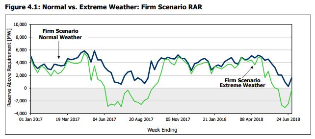
Under extreme weather conditions, the reserve is below the requirement for 19 weeks over the entire Outlook period, with the largest shortfall being approximately 3,000 MW.
19 weeks in 18 months is 24% of the time - corresponding with the quarter of the year known as summer. In a province introducing carbon pricing in January (poorly), apparently the government is unconcerned about local warming.

firmscenario

There has been similar language in previous 18-month outlooks:
During the Outlook period, the...forecasts show that Ontario’s available generation exceeds projected demands...there are periods when Ontario’s available reserves are forecast to be ...below the IMO’s required planning reserve levels.
That from the Outlook produced in April 2002.

I'm sure today's Wynne government finds comfort in how well Ontario's system coped with heat waves in 2002 and 2003 - despite their braying indicating the opposite.

Wednesday, October 26, 2016

Ontario Electricity – The Liberals Giveth and Taketh Away

This is a guest post, by Bruce Sharp.
The post first appeared on Linkedin.

Ontario Electricity – The Liberals Giveth and Taketh Away

The big energy splash in the Ontario Government’s September 12 throne speech was rebating the provincial portion of the HST to certain electricity users. This group will include mainly voters and is estimated to cost about $ 1 billion per year, with the cost being born by provincial taxpayers. In a September 14 Linkedin post, I commented on the merits of the move.

Another electricity move announced that same day was the expansion of the Industrial Conservation Initiative (ICI), otherwise known as the Global Adjustment (GA) Class A.

Ontario’s GA is the electricity market mechanism for collecting and allocating above-market generation and conservation and demand management costs. Prior to 2011, there was a single GA class, with all consumers paying for GA costs based on a uniform, postage-stamp rate. Starting in 2011, we had two classes: A and B, with the classes’ shares of GA costs determined in different ways. This program did not initially have a name but at some point was dubbed the Industrial Conservation Initiative. Class A now pays significantly less than they would have, had we still had one GA class. The result is a transfer of costs from Class A to Class B, i.e. a cost decrease for Class A’s mostly large industrial consumers and a cost increase for Class B -- residential and most other Ontario electricity consumers.

In an April 14 Linkedin post, I provided an update on that cost transfer. Given the recent news, I thought I’d provide another update, estimate the additional transfer that will occur as a result of the expansion of Class A and look at the economics of the initiative.

For the period of October 2015 through September 2016, total GA costs were $12.1 billion. If there had still been a single GA class, the uniform rate would have been $ 86.20/MWh.

With the two classes, there was a cost transfer from Class A to B of $ 940 million. Class A paid an average of $ 52.50/MWh or 39% less than they would have had we still had a single GA class. Class B -- by virtue of its larger total energy consumption -- paid $ 94.60/MWh or 9.7% more. For the residential consumer with losses-inclusive, annual consumption of 9.5 MWh, that represents an added cost (inclusive of HST) of $ 90/year.

The expansion of Class A will take place either July 1, 2017 or July 1, 2018. One source I’ve spoken to says the government will want to do this sooner rather than later. It will likely involve removing baffling restrictions to the 3 – 5 MW eligibility and a reduction of the overall average monthly demand threshold to 1 MW. A thousand businesses are to be newly eligible,

The result will be an additional cost transfer – from the new Class A consumers to the remaining Class B consumers.

How much will it be?

Saturday, July 23, 2016

The growing subsidy of wind and solar in Ontario

I was recently asked the amount of subsidies paid to wind and solar generators in Ontario, and felt answering deserved a blog post. I will show that from the introduction to Ontario's transmission grid of the first industrial wind turbines in 2006 up to June 30, 2016, subsidies to wind and solar generators have been approximately $6.4 billion.
More important than the figure, are the trends in annual magnitude and composition.

I have tried not to use the word "subsidy" in recent years - having been guilty of using poorly in the past. However, it's increasingly clear to me that avoiding the "subsidy" discussion has been harmful to Ontario's ratepayers.

In Ontario the word "subsidy" is often quantified by the amount paid for electricity by consumers above the price of that electricity in Ontario's market. The method of recovering that amount is the global adjustment mechanism. The complicated system with huge figures (on track to hit $12 billion in 2016) meant great attention was paid when the Auditor General of Ontario reported, "[from] 2006 to 2014, electricity consumers have already paid a total of $37 billion, and they are expected to pay another $133 billion in Global Adjustment fees from 2015 to 2032." 


However, with all generators in Ontario now recovering some of their costs outside of the market rate, the global adjustment has become a poor tool for defining subsidy. Treating the global adjustment as a subsidy ignores that Ontario's weak electricity market isn't intended to recover all the costs of generation. When the market functions to provide any indication of generator cost, it is usually only the fuel portion of a natural gas-fired generator's expenses. This makes the global adjustment a poor definition of a subsidy - although it's a fine indicator of the poor quality of Ontario's electricity market.

Friday, January 22, 2016

Beyond expectedly high cost: 2015 Ontario Electricity Summary Part 3

During 2015 most Ontario consumers experienced a 12% rise in the commodity price of electricity. The figure is higher than the 8% average annual increase over the past 8 years, but follows the trend of rate increases that was predictable, and if predictions had been heeded properly, largely preventable. In this post I'll note the actions driving the cost of a kilowatt-hour for the common Ontario ratepayer 85% higher over the past 8 years.

In my first post summarizing 2015 figures, I graphed the annual increases in the global adjustment and accompanied declines in the costs recovered through market sales. From 2007 to 2015 the total cost of electricity supply in Ontario grew from around $8.8 billion to $13.7 billion. The move away from recovering costs through market sales is important, but to find the most basic cost drivers we should first find elements of the $4.9 billion supply cost increase, and then explain the rate escalators taking the 55% increase in supply costs to an 85% increase in the supply price for most Ontario ratepayers.

Unexpecting the expected.

If cost increases still surprise some, it must be that the topic is too complicated for most, because clear warnings have existed. Price forecasting took a huge jump in Ontario with Bruce Sharp's August 2010 report prepared for the Canadian Manufactures & Exporters (CME). Prior to the report the price speculation attached to an escalated push into renewables came from the push's instigator, George Smitherman"We anticipate about 1% per year of additional rate increase associated with the [Green Energy and Green Economy Act] bill’s implementation over the next 15 years." [2]  Sharp's August 2010 estimates put the cost much higher - at about $30/megawatt-hour (MWh) for the renewables supply with additional cost for distribution and transmission charges due to the Green Energy and Green Economy Act. The provincial Long-Term Energy plans following Sharp's report seemed to adopt his numbers, and consequently his forecast altered the reality slightly. Nonetheless, 2015's enormous $9.96 billion global adjustment total is only 2% off the total Sharp predicted in a second report 4 years ago.

Up we went

In my second post summarizing 2015 figures I demonstrated my estimates, inclusive of cost for distribution-connected (Dx) supply, largely agreed with the planned expenditures attached to 2013's long-term energy plan. It is important to note the system operator [IESO] current reporting on 2015 totals is only for "supply connected to the high-voltage transmission [Tx] system." The IESO's Tx reporting, as I've previously communicated, provides an increasingly inadequate image of Ontario's electricity generation - and it's encouraging this is being recognized by sector commentators as diverse as Parker Gallant and Tyler Hamilton.
The following graphic demonstrates my estimates of all 2015 generation (including Dx) and related supply costs (including Dx and curtailment):

Calculation exclude other costs included in global adjustment (such as conservation spending". See footnote 1 data.


The IESO's failure to develop reporting on generation from contracted supply within local distribution networks is now missing reporting on about 10% of Ontario's supply costs - mostly attributable to solar panels.

Tuesday, November 17, 2015

New report numbers the IESO days, shows wind impacting Ontario rates

A new report on Ontario's daily electricity sector demonstrates the shortcoming of reporting of the sector's costs that contributes to the poverty of intellect in much too common communication on the sector.

The new report is from me, and it is to provide consumers, and other critics, with a more intelligent summary than the little noticed "Daily Market Summary" produced by the province's system operator (IESO). I hope some readers will work through the additional numbers as they can demonstrate the broad themes driving pricing in Ontario - and if some that do the work join a chorus calling for some transparency and meaningful reporting from the IESO,  my work in creating the reporting will be somewhat justified.

If one were to have no other information than the IESO Daily Market Summary reports for November 10th, and 12th, they'd think a little less demand - 187 megawatt-hours (MWh) - resulted in the price dropping $27.59/MWh to essentially free.

Ontario's demand for electricity did not change. The IESO's "demand" is not Ontario's consumption, but the demand for supply from generators in the IESO's market.

There are qualitative issues with the IESO report.
The HOEP price is the Hourly Ontario Energy Price. The weighted average is arrived at using hourly "Ontario Demand" and hourly HOEP - if one wanted to competently establish the "Value of Market Demand" they would not do it as the IESO does in this report. The weighted average price of exports has always been different, but since the IESO prohibited negative-priced exports the difference can be enormous.

Beyond the qualitative issues with the IESO's report is the absence of any attempt at costing the procured supply (their "demand"). With the global adjustment mechanism driving prices, this renders the report essentially worthless

Monday, November 2, 2015

October revealed flaws in Ontario's rate and electricity market designs

October 2015 provided a unique opportunity for analysis of Ontario's electricity supply system as the Darlington nuclear power station was unproductive due to a planned vacuum building outage. During the previous October Darlington generated 2.5 million megawatt-hours (MWh) of electricity, which was 23% of what the province consumed during the month. 2015's October therefore provides a glimpse of what Ontario's sector will be like in a few years, as the Clarington Transformer Station is completed and Pickering Nuclear Generating Station is closed.

Vacuum building outages are scheduled for the lowest demand periods of the year, and October is one of those month. October 2014 saw a glut of power and concluded with a $1+ billion estimate of the global adjustment (the difference between what the system pays suppliers and what is recovered through the sale of power at market prices). With the rise of solar (largely unreported in the province) Ontario regularly exceeded $900 million during the sunnier months of this year's second quarter, but 12 months ago $1 billion was a stunning, unprecedented number. Parker Gallant and I published an analysis of 2014's October noting:

  • the record high global adjustment total
  • the record global adjustment rate for the 90% of consumption that can be considered "Class B"
  • the record low Hourly Ontario Energy Price (HOEP) the market determined
  • the record low price for exports
  • the high level of curtailed generation (contracted supply the system could not take)
  • record supply from wind and solar generators.
Figure from IESO June 2015 18-Month Forecast
Ontario's system operator, the IESO, would include a graph of curtailments in June 2015 that showed Parker and I were close, if a little enthusiastic, in this claim:
During October, 2014, the IESO curtailed more than 500,000 MWh of production. While wind power accounted for 100,000 MWh directly, much curtailment at nuclear and non-utility generators (NUGs) and import cuts occurred due to bloated supply levels during periods of windy weather. If one combines the curtailed production with the exports for October, it is obvious that Ontario dumped more than 21% of the province’s procured (and paid-for) supply
October 2014 exports totaled 1.8 million MWh, dumped at an average price of about half of one cent per kilowatt-hour ($5/MWh). The 2.3 million MWh total, from exports sold at an enormous loss and supply simply curtailed, is only slightly off the 2.5 million MWh reduction in Darlington's production the following October. Ontario's demand was little changed from 2014's October to 2015's.[1]

It might surprise readers that much of Darlington's missing generation was replaced with generation from other sources, as exports dropped only 300 thousand MWh.

Tuesday, October 6, 2015

IESO reporting raising doubts about its ability to administer Global Adjustment charges

There are 5 hours every 12 months that determine the distribution of global adjustment charges in Ontario - charges of nearly $10 billion over the past 12 months. The 5 hours are particularly important for Ontario's largest consumers of electricity as cutting one megawatt of use during one of these hours has been estimated to save from $50,000 to $100,000 and more. In this post I'll explain why the hours for the adjustment period ending next April have likely already occurred, with some implications of peak hours for intelligent energy policy.
Background: "Stakeholders" destroying the viability of Ontario's electricity market
While the top 5 hours have already occurred the IESO is not communicating what they are. To understand why the IESO's communication of peak hours is inadequate, it's important to know the definitions of "Ontario Demand", "Allocated Quantity of Energy Withdrawn," and what I'll call "consumption."

  • The IESO's "Ontario Demand" is really demand from IESO transmission (Tx) connected suppliers, including imports. The figure does include generator consumption and transmission losses.
  • The supply withdrawn from that grid by local distribution companies (LDCs) and wholesale consumers, essentially comprises the "Allocated Quantity of Energy Withdrawn" (AQEW). The AQEW and "Ontario Demand" figures do not include generation from suppliers embedded in LDC grids (Dx): 
  • "Consumption" will be AQEW plus "the total volume of electricity, adjusted for losses as required by the Retail Settlement Code, that was supplied by embedded generators to licensed distributors." (Ontario Regulation 398/10)
High 5 hours are determined by AQEW, but the proportionate share of the global adjustment is determined by a Class A user's AQEW (their metered use) as a numerator with total provincial consumption as a denominator.

During an adjustment period the IESO lists only the 10 top daily "Ontario Demand" hours:


The fact that they show AQEW for those hours shouldn't be confused with showing the 10 highest daily AQEW peaks - because after the last adjustment period class A users were surprised to find 2 of the High 5 hours were never shown on IESO's "Top Ten" list as the year progressed.

Thursday, October 1, 2015

Wasting legacy asset value in Ontario: supply income redistribution due to the global adjustment


I regularly update data the drives pages on my data site. Pages on the site are meaningful to me because I recognize the changes over time - as well as seeing changes I anticipate become reality. Today I created a graphic from data that drives the Supply_Costs page, and will use this blog post to attempt to make the graphic meaningful for you.

When understood, this chart indicates numerous issues behind rate increases in Ontario - increases which hit a staggering 26% in the second quarter of 2015.

Monday, August 24, 2015

IESO Reporting Challenge: concerning Fig 23

Everything is political.

Working with data, the political introduces itself largely in reporting. The planning, structuring and collection of data all involve organizational power structures, but in an intelligent system all are dependent on operations and/or the current, or envisioned, demand for reporting.

I usually find reporting to be the least enjoyable aspect of working with data. Querying data can be very informative, and much of my writing takes one aspect of a data set and explores it with words. Reports are often designed for other people, to their design - particularly executive reporting, which is designed for a quick hit on the status presented in a format the executive are comfortable with.

The IESO eventually posted a report for June, weeks later than usual. That is interesting in itself, as it implies the report is designed for an audience the doesn't need it any particular time. I can't think of a benefit of variable intermittent reporting (VIR) in Ontario's electricity sector - must be part of a bigger trend to variable intermittent stuff.
Whoever the important audience is for VIR, the June report had at least one new graphic which must be for them:


This is not the format of reporting on generation I would expect the people reading through a summary report to find relevant. The IESO's long-standing Figure 18, "Monthly Energy by Fuel Type," is a graph of monthly production in the same stacked chart format, but for coherent categories; nuclear, hydro, gas/oil, solar, wind, biofuel and imports. I would think normal people looking at a monthly report might like cost information for the same categories they receive production information.
Like this:

Sunday, August 9, 2015

A heat wave exposes Ontario's electricity data and policy failings

The last week of July saw the hottest days of 2015 driving electricity demand to it's highest levels in 18 months. Market data for the month, coupled with the newest estimate of the month's global adjustment costs, indicate a fourth consecutive month of  20+% increases over 2014's electricity commodity pricing. A mainstream media site, the Toronto Sun, posted an editorial titled Wynne's hydro policy is insane. The editorial picked up on some of the poor decisions causing rising pricing but contains some data errors. These errors are understandable given the inability of Ontario's system operator, the IESO, to update its methods of accounting for electricity generation, and costs, since absorbing the Ontario Power Authority at the start of 2015. Not only has reporting not advanced, the IESO displays declining competence in producing the reports it historically has.

July's steep price increases, and The Toronto Sun editorial, follow a report by the Ontario Chamber of Commerce (OCC) indicating 1 out of 20 businesses in the province anticipate closing in the next 5 years. Facts the Sun's editorial gets some serve as a nice illustration of the OCC report's first recommendation:
Increase transparency of electricity pricing and system cost drivers
I'll use the highlighted elements of the Sun's editorial to demonstrate the IESO's growing inability to report on supply and demand in Ontario's electricity sector.

Monday, July 13, 2015

Data-driven thoughts on mitigating electricity rate increases

I started writing what became this post as a quick tumblr hit on a single graph  - as I started writing I  brought in comments on the OCC piece more suited to my coldaircurrents site, and as I felt it necessary to point out the data problems are actually people/organization problems, the work ended up on my more flippant Wordpress site.


The Ontario Chamber of Commerce (OCC) released a report last week:
Empowering Ontario: Constraining Costs and Staying Competitive in the Electricity Market, takes a look at the driving factors behind rising electricity costs in Ontario.
It’s about time - at best; it may be too late. Near the end of 2015's first quarter I wrote  Ontario's new electricity pricing program essentially taxes businesses to fund social program, which concluded many of the OCC’s members would be walloped by coming pricing changes:
Businesses below 3 MW average monthly peak:
  • get stiffed with the continuance of the debt retirement charge
  • get stiffed with the OESP [Ontario Electricity Support Program]
  • get stiffed with the expansion of the class A program
I’m sure that’s confusing to many, but that "Businesses below 3 MW average monthly peak" class of customer did see the commodity rate it pays for electricity rise 25% from 2014′s second quarter to 2015′s, so I’m not surprised there’s some motivation to address the issues. However, the Chamber has more work to do in getting through the confusion.