
This post
continues the analysis, of Ontario electricity sector data, that is
loosely guided by Chapter 6 of a recent study from the Oxford
Institute for Energy Studies. Previously I demonstrated what typical wind
production will look like in the coming years.
Now we’ll look at the overall supply picture in an Ontario context.
Ontario’s electricity system is characterized
by a very large nuclear component, and a significant hydro component that
generally lacks reservoirs. As demand
has dropped in recent years (it peaked in 2005), intermittent sources
have come into the generation mix on a ‘must take’ basis. I’ll address the current mix this has left us, and the issues already apparent in Ontario due to that mix,
before forecasting some figures for future years.
My starting
point for modelling consumption is hourly generation data for 365 days
beginning September 15th, 2010.
During this timeframe it’s important to note that Ontario consumed about
142.1 TWh, but generated about 153TWh.
The Hourly Ontario Energy Price (HOEP) average is $32.76 over that
time, so our current export levels are driven by a supply mix issue - not profits. My
evaluations do not incorporate exports. 142 TWh is approximately what Ontario's consumption was in 1989 - my evaluations do not incorporate increase/decreases in demand.


This graph
is formatted to mimic the graph on page 67 of the Oxford study, which is grabbed from the screen
and presented here as “Figure 39.” I’ve
copied the colours, units and stacking order. It's a rather stunning difference!
In Ontario we have one of the lowest emissions intensity generation
systems on the planet, characterized by a large, inflexible nuclear component
and a large hydroelectric component (shown at 110 g CO2 eq / kWh in the 2009 Canadian GHG Inventory reporting). In
the UK they run baseload coal and have a large natural gas component. The Oxford study, forecasting out past 2020, concluded “the demand for
gas is remarkably robust” despite enormous growth in Industrial Wind Turbines
(IWT’s), due to both “the inherent need for gas to provide flexible balancing
for wind and the significant variability of wind generation,” and a void left
by retiring coal-fired generation. In
Ontario, the question is will increased industrial wind turbine (IWT) capacity necessitate replacing existing low-emission baseload sources (nuclear), with
flexible high-emission sources (natural gas).
The term
Surplus Baseload Generation (SBG) has become prominent in Ontario’s electricity
sector since 2009’s recession drove down demand (which was already declining at
a slow rate). Baseload primarily
referred to nuclear (the CANDU reactors in Ontario are not currently capable of
following load - although some can avoid producing at full output, there is no
cost savings in doing so), and a significant portion of our hydro generation
which is basically run-of-the-river. The
rest of the hydro is also available on a use-it-or-lose-it basis, but the
output can be varied by hours, or maybe days.
Baseload also refers to other supply, including a group known as
non-utility generators (or NUGs), as well as supply that must be taken when
available (this is how the wind contracts in Ontario have been
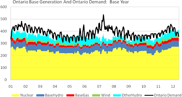
structured). Here’s another chart from
the same data set behind the previous Ontario chart – this time baseload
sources are broken out (using IESO figures as the basis for estimating baseload
amounts) – a black line indicates Ontario's demand level:

These are daily totals, masking much of Ontario’s problem of
surplus baseload generation (SBG), which is far more pronounced between
midnight and 6 am. Regardless, anytime
the supply bars exceed the height of the black line representing demand,
Ontario is a net exporter. April 7th
is the only day on this chart where Ontario was a net importer of
electricity.
I want to
concentrate on the graph below the red, natural gas generation, bars. This represents supply that is either
baseload, or the category I’ve title “OtherHydro” which is included because it
is assumed it will be utilized, having no incremental emissions, or any cost of
production. What is particularly
interesting, and indicative of a very damaged market structure, is the largest white
space, between the base generation bars and the demand line, matches the lowest
commodity rate of the year concurrent with July's heat; and the excess of baseload seen from the middle of
April right through the lower demand spring season, matches the highest price of the year. I think it is evident it does not pay to
commit to too much supply.

This is the
view I wish to replicate in communicating the forecast for future years. It seems to me we want to fill the white space with a cleaner supply, without going over the black demand line. Forecasting doesn't bear that out.
The forecasting is based on the same supply
mix chart that provided the graphing
in my previous post. The nuclear
production pattern is calculated monthly, by taking the monthly production
totals from the years 2006-2008, and calculating the monthly capacity factor
for all nuclear by using the nuclear capacity of 11446MW, which was constant
through those 3 years. The years were
chosen as they contained neither vacuum building outages (exclusive to CANDU
reactors), nor prolonged periods of surplus baseload generation (SBG). There are a number of assumptions made
regarding future nuclear capacity here.
They include:
- Pickering continues operation until refurbishments are concluded
- Pickering, and Bruce A units 3 and 4 have work done to extend their operations prior to the major refurbishments beginning in 2015 (the equivalent of one Bruce reactor is planned offline following the return of two other Bruce reactors in 2012).
- 3 reactors, of the 10 to be refurbished at the Bruce and Darlington sites, are under refurbishment at any one time, beginning in 2015 and running until 2022
- When refurbishment concludes in 2022, Pickering is retired from service
This is one
scenario that is plausible. With some
question as to Pickering, it’s the scenario from the government’s long-term
energy plan tinkered with due to other information including the Ontario Power
Authority’s documents related to the Integrated Power System Plan development.
Baseload
hydro is taken from IESO 18-month outlook, by working with figures from the 10th
week of 2012 and going through the 9th week of 2013. The figure is adjusted proportionately with
the increase in hydro supply in the years up to 2022. The ‘OtherHydro’ category is also adjusted
proportionally. The wind process is the
same, and unchanged from yesterday’s post.
Notably absent is solar output.
The reason is I simply have no data to forecast ouput
with (if you have estimated capacity factors by month and hour of the day
please email
them, and I’ll find some time to add the figures) – the reason I find
that acceptable is generally the SBG hours are at night, and solar will be more
related to issues of peaking, and the utilization rates of natural gas
facilities. Both are important to
pricing, but beyond the scope of this post.
By 2014 my
forecast has about 300MW more hydro capacity, 765MW more nuclear capacity, and
about 2000MW more wind capacity (most of these are based on OPA
reporting). This mix pushes these
sources up to supplying most of Ontario’s demand with the exception of some
cold winter days, and, primarily, the heat of July.

In 2014 the expectation is that exporting, or dumping, is necessary much of the time, and is likely to be accompanied by paying generators to curtail supply (I wrote on some methods the IESO currently has to curtail supply here). But the amount of demand space needing to be filled, most likely by natural gas generators, has shrunk.
By
2018 nuclear capacity is reduced 1750MW
(from 2014 levels) , due to refurbishment activities, while hydro increases by
about 700MW and wind by another 3000MW. Despite adding about 2000MW of supply, more white space on the graph indicates more peaking supply is needed. Similarly, the erratic nature of
wind supply results in far more ‘baseload’ supply than demand is expected to be
able to handle.

Things don't change much between 2018 and 2022. When the final 3 refurbishments return to service, Pickering is retired and that likely will be a trade-off (Bruce and Darlington units have had much higher lifetime capacity factors) - so the 2018 graph likely won't change very significantly. And that would then remain substantially true through at least 2035.
I stated I'd examine the supply mix issues and estimate a price for the decisions being made in the offices of the Minister of Energy. The costing will wait on another post. Aside from the omission of all figures regarding solar, there are questions of capacity to meet system peak, and the costs of diminishing utilization of resources. This post shows the costs of producing too much supply is a very real concern, and illustrates the reasons the IESO seeks to ensure supply response/curtailment processes are in place for intermittent generation supply (re: a process to pay wind suppliers for the output foregone because the grid can’t accept it.)
Looking at the chart for today, it doesn't seem that daunting a task to fill the gaps with cleaner supply.
Looking at the chart for 2018, it doesn't seem that was the task we addressed. The task we addressed was adding more renewables - but we can't demonstrate why.
"...we should ask ourselves what our aim is. Is it to stop climate breakdown, or is it to engineer the maximum roll-out of renewable power? Sometimes it seems to me that greens are putting renewables first, climate change second."
NEXT: Industrial Wind, SBG, $3.3 billion ... and more
Wow that was strange. I just wrote an very long comment but after I clicked submit my comment didn't appear. Grrrr... well I'm not writing all that over again.
ReplyDeleteAnyways, just wanted to say great blog!
Look into my web site: how many calories do you burn walking
My web page - walking calculator
Valuable information. Lucky me I discovered your web site accidentally, and I'm surprised why this twist of fate did not happened in advance! I bookmarked it.
ReplyDeleteFeel free to visit my blog post :: Rmr Calculator
I need to to thank you for this wonderful read!
ReplyDelete! I certainly loved every bit of it. I've got you book marked to look at new stuff you post…
Here is my website ... what is a graduate certificate
42B1B7F613
ReplyDeleteBeğeni Satın Al
Mobil Ödeme Takipçi
Bot Takipçi Atma
61A024F2AE
ReplyDeleteTakipçi Satın Al
Film Önerileri
İndirim Kodu
B2076648
ReplyDeleteakşehir esçort
esçort erzincan
esçort bayan maraş
düzce esçort
nazilli esçort
esçort bayan amasya
bucak esçort
karesi esçort
esçort sakarya