
The Fraser Institute recently released an analysis prepared by Tom Adams and Ross McKitrick that is particularly critical of wind energy as it impacts Ontario's electricity pricing, "What Goes Up: Ontario’s Soaring Electricity Prices and How to Get Them Down" (.pdf). Soon after the Canadian Wind Energy Association (CanWEA) issued a response (.pdf). Lorrie Goldstein wrote, in the Toronto Sun, that a paper Parker Gallant and I issued delivered the same message as the McKitrick/Adams study ("the study") . I suppose that's fair, and this post will show why criticisms leveled don't invalidate the study's conclusions, but do discredit the critics hired by CanWEA.[1]
McKitrick and Adams worked together to collect data and build an econometric model of the global adjustment (GA). I would consider myself as talented as almost anyone in data collection, formatting, storing, and querying, but certainly not statistical modelling, as McKitrick has done. I expect to complement the report in demonstrating some multipliers that do exist, but I won't comment on the model, Analysing at too detailed a level would reveal a myriad of problems with historical data, and cost shifting between months, and even years, incorporated into the global adjustment. None of which would be relevant to the implications and recommendations of the study.
One element of the study that I noted with pleasure was their model indicating wind acted as a capacity cost (and not an energy cost).
Many jurisdictions looking for the best way to keep the lights on are evaluating the best way to ensure reliable capacity exists to constantly meet demand. It's not uncommon to see a separation, at least theoretically, of "energy" value, or the worth of a unit generated, and capacity value - the value to be capable of generating "energy". The study claims wind shows to be a capacity purchase more than an energy purchase:
Wind capacity has massive explanatory power, effectively dwarfing every other variable except hydro capacity. This strongly suggests that ... the GA has evolved in a manner highly consistent with a system in which wind farm operators are contracted for capacity rather than merely generation.The study's econometric model is indicating that Ontario's contracting of wind, on a "must take" basis, isn't acting as an energy cost, but a capacity cost. This is precisely how I treated wind in a costing exercise I put together during Ontario's Long-Term Energy plan period.
The annual performance of a wind site in Ontario can be established with existing technologies, prior to construction, and the feed-in tariff mechanism tends to introduce existing technologies in a manner lacking innovation - because it offers a nice return if performance comes close to expectations. If the wind installations are operated competently, they'll perform at ~30% capacity factors (a 100MW wind farm will have a weighted average around 30MW over the length of a year). Proponents of industrial wind have long argued the recipients of contracts, particularly feed-in tariff contracts, don't get paid if they don't produce. This is obviously true, but they still get paid something if they produce poorly - which a properly structured "capacity" payment would not do.
The reality is wind generators have little capacity value. The extent to which the traditional forms of capacity payment made in Ontario [2] are attributable to contacting of sporadic wind is debatable, but it's understandable that the study found wind looks like a capacity purchase.
A capacity purchase of a product without significant capacity value.
But there are interaction effects between generators that influence overall consumer cost and must also be taken into account. For instance, wind turbine operators can bid into the market at low (and even negative) prices because of their revenue guarantee, which drives down the wholesale price across the market, increasing the gap between what other generators are paid and the revenues they were guaranteed by the province. The addition of new wind capacity exacerbates this distortion, creating a second-order effect on the GA [global adjustment].Impact on the Global Adjustment
The rebuttal CanWEA purchased to refute the study spent a lot of words trying to downplay the global adjustment.
Tom Adams is extremely knowledgeable on the Ontario electricity sector and that's clear in the background provided in the study. My quick overview of the global adjustment (GA) as it is today:
 |
| Figure 1 from the study |
- There is a market for electricity which recovers some of the cost of supply, but essentially all suppliers are guaranteed payments through contracts or regulated rates regardless of market recoveries
- The mechanism to recover full costs of supply from consumers of electricity is the global adjustment which collects the difference between the value at market rates and the contract arrangements.
The study looks to the GA as the cause of price increases, probably because the HOEP is not trending up - aside from an upward blip last winter, it hasn't moved all that much since 2009 either way, while the overall price is.
CanWEA's report states "any change in HOEP is approximately offset by an inverse change in the GA, with virtually no net change in consumers’ bills." I do understand that position as it may be developed off of my response to claims, initially from Greenpeace and then echoing around green chambers, that nuclear's share of the global adjustment was it's share of responsibility for increasing electricity rates. But total prices are rising, the study notes they are rising, and the rise is noted as presenting itself in global adjustment component.
The study is noting the cost increase for the bulk on Ontario's electricity consumers, and that group is negatively impacted as less of the contract cost is recovered by sales at market rates.
The study is noting the cost increase for the bulk on Ontario's electricity consumers, and that group is negatively impacted as less of the contract cost is recovered by sales at market rates.
There are 3 distinct consumers of Ontario's electricity: one pays no global adjustment (exports), one benefits from a low market price and therefore a high global adjustment billing component (class A), and theres' the rest of us. Whether billed as a "class B customer, or on a regulated price plan (RPP), the charges should average out for most Ontarians as the average HOEP plus the GA rate. I displayed how the pricing for different groups is working out this low-HOEP October in work I did with Parker Gallant, and here I'll add the same analysis for high-HOEP February.
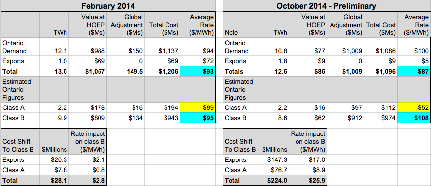
These estimates illustrate that October's lower HOEP rates did save export customers money, and Ontario's large class A customer's save big with a low HOEP, but despite October's lower average price for a unit of energy, the rest of us (class B) see much higher rates.
The more of the commodity charge recovered by the global adjustment component, the higher the commodity price paid by class B consumers. Therefore, if a generator forces down the HOEP more than other generators, it would cause the rates of class B customers to rise.
Wind does cause the HOEP to drop and that, added to the expense of purchasing the output from wind turbines at contracted rates, must create a "a second-order effect on the GA."
Any low-variable-cost generation – wind, nuclear, coal, etc. – tends to reduce HOEP because it is set to balance supply and demand.
.png) |
| MWh data captured of IESO Output and Capability report |
 |
| Data sources required, for HOEP, wind output, demand and trade, all from IESO |
The study by McKitrick and Adams treated the price of natural gas as relevant to the HOEP, and the CanWEA-purchased rebuttal spends time attacking the study's treatment of both HOEP and natural gas pricing.
A problem for any model design must be that gas doesn't always set the market price in Ontario - and it has been less frequently doing so.
I can explain how price is set in Ontario by stepping away from the report, and counter-report, and mining my own data. Doing so will prove incorrect this 0.2¢ claim:
Power Advisory estimates that if Ontario had had no wind generation in 2014, and had not replaced this missing wind capacity with any other type of generation, HOEP would have been approximately 0.2¢/kWh higher.The data I've stripped groups my best estimate of Ontario load (demand) less the hourly committed purchases of generation. This requires estimates of both, because the IESO's reporting of both supply and demand is decreasing in quality as embedded solar, wind and other generation increases within Ontario's supply mix. I've used the term "load" to capture the demand that is cancelled out by embedded generators in the IESO's definition of "Ontario Demand."
In estimating committed purchases of generation, I've considered all nuclear all wind, including an estimate for embedded wind, solar, all hydro (which assumes production schedules in a rational manner), and non-utility generators that operate essentially all hours. My estimates of committed supply includes my estimates of curtailments. The hourly estimates (from September 2010 on) have been grouped into 500 megawatt segments. The graphing shows gigawatts; negative numbers mean exports are necessary due to committed supply exceeding Ontario's loads, and positive numbers mean we need additional supply (expected to be from the province gas generators).
The graph indicates as we move from oversupply (negatives) to needing more supply, price rises:
.png)
.png) That big rise in "13/14" (from Nov. 1, 2013 to Oct. 31, 2014) muddies the picture up, but it conveys a lot of information too, as it mainly coincides with a high demand winter with scarce natural gas and therefore very high natural gas pricing. With coal retired completely, when Ontario requires more supply than it has committed to, natural gas should set the price. It is important to note that while the 5 highest daily peaks of "13/14" occurred in winter, Ontario was not only a net exporter for all of them, net exports significantly exceeded wind generation during all those hours. If wind didn't exist it need not be replaced with anything.
That big rise in "13/14" (from Nov. 1, 2013 to Oct. 31, 2014) muddies the picture up, but it conveys a lot of information too, as it mainly coincides with a high demand winter with scarce natural gas and therefore very high natural gas pricing. With coal retired completely, when Ontario requires more supply than it has committed to, natural gas should set the price. It is important to note that while the 5 highest daily peaks of "13/14" occurred in winter, Ontario was not only a net exporter for all of them, net exports significantly exceeded wind generation during all those hours. If wind didn't exist it need not be replaced with anything.Removing the high priced recent year shows why negative price exports were ended in 2012, how net revenue requirement contracts can flatten the price until load significantly outstrips committed resources, and how similar price has been over the years looked at this way -by the committed supply relationship to demand/load.
Graphing the number of hours in each of the partitioned groups produces a typical distribution, but one shifting left, indicating increased commitments to supply without corresponding changes in demand.

The graphs showing the distribution of market rates (HOEP) and hours by grouping of excess/needed supply indicate more supply is being sold at lower pricing. It should come as no surprise that it's being sold outside of the Ontario market during periods of excess supply.

On all of these charts you could estimate the impact of wind as it has produced, on average, approximately 870 megawatts an hours over the past 12 months - so it's approaching 1 unit on the scales of the horizontal axes of the graphs I've displayed, up from half a unit 3 years earlier.
 |
| Estimated HOEP cost reduction due to wind |

The Power Advisory statement that "if Ontario had had no wind generation in 2014,...HOEP would have been approximately 0.2¢/kWh higher," is entirely without merit. The impact was twice that in Ontario and is trending much higher through the first 10 months of 2014. The actual impact on HOEP is many multiples higher than Power Advisory's estimate.
They seem to have ignored some multiplier affects!
I hope I've found some new ways to communicate some older truths in this post. It is important to recognize multipliers that we should know of:
- a transfer in supply costs from market recoveries, at the HOEP, to the Global Adjustment charge is a shift in cost from very large (class A) consumers to all other consumers
- the lower the HOEP the lower recoveries on exports and therefore the Global Adjustment moves higher
- wind lowers HOEP and often presents itself when Ontario is committed to purchasing more power than it consumes (driving up exports and down prices)
The study the Fraser Institute published, by Ross McKitrick and Tom Adams, indicates their econometric model show, for wind, "The system-wide cost effect is about 3.6 times the direct Feed-in-Tariff (FIT) payment burden." CanWEA says there is no multiplier affect. I suppose the truth may be somewhere in between, but I'm not certain that the actual number is knowable or particularly relevant.
The mechanisms that cause industrial wind to have a price impact on most Ontarians above the purchase price of the wind are known; they are ignored, hidden, and/or denied. It seems to me likely that the reason for this is transferring costs to most, as wind is being used to do, does benefit a group.
A very influential group which will be the topic of another post.
Endnotes
1. McKitrick and Adams responded to Power Advisory LLC's criticism with Hot air from the wind lobby
1. McKitrick and Adams responded to Power Advisory LLC's criticism with Hot air from the wind lobby
2. Net Revenue Requirements for natural gas generators are the most notable of these, but there have also been reliability must run contracts for Lennox (dual fuel: oil and natural gas), and contingency payments for coal-fired units). All act as contingency payments.
3. I dislike using trend lines from spreadsheet programs, so I checked this one against the data prior to November 2013 using a 12-month moving average (arithmetic) to check against the trend line.

That looks good, showing the slow increase, but the picture changes rapidly in November 2013, the first half of which had extremely low HOEP rates, and the end of March 2014 (after 3 months of high rates due to gas prices and cold weather).

The trend line put on by Microsoft's Excel is now lower than the 12-month moving average, which may very well show the MS trendline corrects for the winter spike in rates.
DE28637410
ReplyDeletekiralık hacker
hacker arıyorum
belek
kadriye
serik