
- the role of electricity in the broader energy sector;
- the role of natural gas in the electricity sector;
- decarbonization;
- the role of Quebec supply in Ontario’s electricity mix;
- the role of pricing to encourage electrification of transportation;
- the role of nuclear and desirability of refurbishing Pickering B,
- the role of storage,
- the future supply mix,
- pricing policies to shift consumption to periods of excess supply.
If you follow me on Twitter you may have seen the first numbers in the IESO’s summary, albeit in different units, days before the IESO posted them. Whereas the IESO posts these separately I’ll show the past 8 years here:
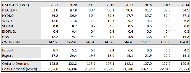
If you follow my reporting more closely you may have realized these don’t exactly match the numbers displayed in my Power BI reporting (which, when all is well, updates daily). The differences are not without meaning. The IESO’s annual data matches an annual summary of data from its Generator Output by Fuel Monthly reporting, whereas my basic report using Power BI takes its data from the IESO’s Generator Output by Fuel Hourly reporting. This means the IESO’s monthly reporting isn’t summarized from its hourly reporting. My assumption is one is dispatched/scheduled in the system and the other based on metered production .As nuclear and hydro annually produce more than the hourly figures show it seems those generators often produce more that scheduled, while gas output is consistently 3-4% below what the hourly figures indicate - quite possibly as they’re adjusting for the variations in supply (including from nuclear and hydro) as well as demand. The surprises to me are in the small generators: solar is still producing about 7% more than dispatch, and most years biofuel is also off.
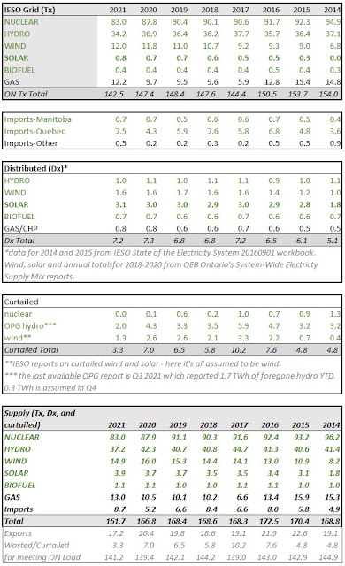
There remains scarce hourly production data for solar generation in Ontario. The facilities on the IESO-controlled grid (ICG) have reporting in an hourly output and capability report - and that report does summarize to the hourly by fuel report. Those solar facilities only comprise 16% of the contracted solar capacity in Ontario that has entered commercial operation. That is the only hourly production data those modeling different electricity supply mixes have to work with, and the annual IESO year-end summary tells us it isn’t of great quality. There is an additional issue with using the actual production data as the panel capacity of sites is hidden - we know at least a couple of the sites are 40-45% overbuilt with panel (DC) for the grid connection (AC).
The IESO offers very little reporting on generation embedded in the networks of the province’s Local Distribution Companies (LDCs). The IESO’s year-end summary for 2021 does provide figures, by fuel type, for “Grid-connected capacity”, but omits the distribution generation contracted by the very same IESO.
The 13,089 megawatts (MW) the IESO reports as nuclear capacity was not actual available capacity during 2021, and hasn’t been since the fall of 2016 when “breaker off” occurred and the refurbishment of Darlington unit 2 began. Before that unit returned in May 2020 Bruce Unit 6 entered refurbishment, and it was joined late in July 2020 by Darlington’s Unit 3. In 2021 nuclear capacity was therefore less than 11,400 MW, and when Darlington 1 enters its refurbishment in the near future Ontario will drop to approximately 10,500 MW of functional nuclear capacity. It is not planned to rise above that level again.
My perspective on the loss of Pickering is that it creates a short-term capacity gap: by 2033 we’ll return to the nuclear capacity level we will have this summer. In 2021 we were already viewing what the loss of a majority of Pickering’s production would look like all other things being the same, but the IESO is not forecasting all other things to be the same. Their outlooks now forecast demand to increase.
Historically we’ve tended to over-forecast demand.
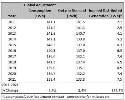
The IESO reported Ontario Demand of 133.84 TWh but this too is not meaningful without context: their “Ontario Demand” is demand for supply from the IESO-controlled grid. The more generation that is embedded in distribution networks, and the more electricity that is self-generated behind-the-meter/fence, the lower “Ontario Demand.” One way to see that the decline in Ontario Demand exaggerates the decline in the use of electricity in the province is to use the “Consumption” figures reported with Global Adjustment reporting. Through trial and error I came to assume 2.1% of generation does not get to be charged as consumption (assume mostly transmission line losses although a small part is generator consumption).
There is a third type of supply that costs Ontario’s electricity ratepayers beyond that reported on by the IESO (Tx) and distributed (Dx), and that is contracted supply that is curtailed rather than accepted onto the grid. The IESO’s annual year-end-data review is the only time I see numbers on their curtailment published. In 2021, “A total of 1,289 GWh of variable generation was curtailed,”as was 22 GWh of potential nuclear generation. In addition to the IESO specifically curtailing supply, the public generator (OPG) reports on, “Production forgone at OPG’s regulated hydroelectric stations due to [Surplus Baseload Generation] conditions.” Through September 2021 1.7 TWh of potential waterpower generation had been spilled, and I anticipate that the full-year total will be near 2 TWh. Curtailed supply in 2021 will be approximately 3.3 TWh, which is less than half of 2020’s 7 TWh and the lowest level since reporting became available in 2014.
For a picture of all the supply involved in the charges the IESO reports the curtailed and embedded supply need to be added to the generation on the IESO-controlled grid provided by the IESO.
There’s a lot in here but I want to point out just a few things before moving onto cost:
- The 0.8 TWh reported by the IESO is a very small portion of annual solar generation in the province which is likely a little over 3 TWh
- Production from industrial wind turbines was up from 2020 to 2021 only because curtailment of wind was down
- Nuclear production in 2021, with 2 reactors offline for refurbishment throughout the entire year, was13.2 TWh below production and curtailment was in 2014, which equates to over 60% of the average annual output from the Pickering Nuclear Generating Station
- Hydro has good and bad years which 2021 allowing 7.5 TWh less generation that was available in 2017
- Gas generation was up 2.5 TWh from 2020 to 2021, as hydro and nuclear were down.
The final element of the IESO’s 2021 Year-end data summary I want to discuss is their treatment of pricing, which simply provides the average Hourly Ontario Energy Price (HOEP), weighted to Ontario Demand, and the Class B Global Adjustment. I find that problematic as the introduction of a “Non-Hydro Renewables Funding” mechanism moved much of the cost of wind and solar contracting off of electricity ratepayers and onto taxpayers. I think that makes sense (as much of that contracting was for political purposes beyond providing electricity), but some effort can be made to provide continuity in data so that costs can be compared between years.
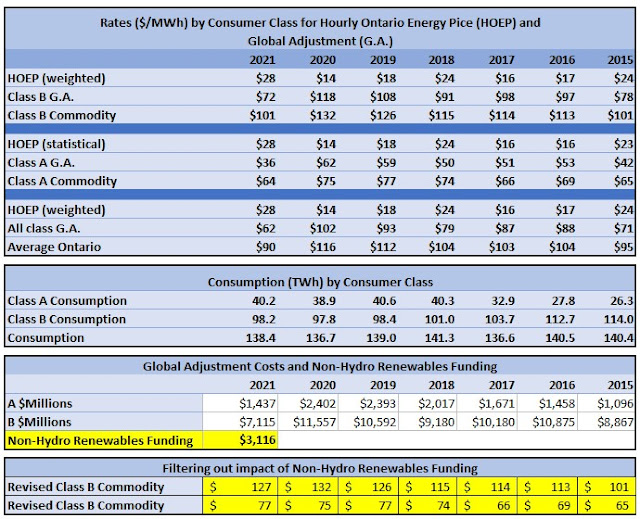
My favourite statistical quirk in the previous table is in the Class A and B commodity pricing of 2015 and 2021. With the benefit of the Non-Hdyro Renewables Funding both classes paid the same nominal rates in 2021 as 6 years earlier, but the average rate paid by the two classes dropped $5/MWh. This is explained by the movement of consumers from the higher rate Class B category to the lower cost class A. Over the period lower requirement to participate as class A consumers grew that class 53% as it went from 19% of provincial consumption to 29%.
No comments:
Post a Comment