“Baseload” is a contentious term in energy discourse. In analysing electricity data in Ontario it occurred to me there’s a simple way to demonstrate the potential value of supply that delivers a consistent output all of the time - one that ignores all generation technology, using only hourly demand data. In this post I’ll demonstrate this methodology before discussing implications for supply mixes.
“Base” and “Load” are two fairly well-defined terms - neither of which are strictly adhered to in my methodology.
“Load” I treat as whatever data I have. I’ve collected available hourly, or half-hourly, data for 3 Canadian provinces, 5 Australian states, and 5 US systems. The data is unlikely to be equal: one example is the figure used for Alberta is “Alberta Internal Load” which includes “behind-the-fence” self-generation unlike the Ontario system operator’s “Ontario Demand”, which only reflects supply from their grid. I am not aware of what supply is included, or excluded, in data I’ve collected from the U.S. Energy Information Administration (EIA) or the Australian National Energy Market. Until the case study section of this analysis the differences can be ignored.
“Base” could be called minimum, but I think it’s helpful to eliminate outliers. The most extreme example is the great blackout in August 2003 that impacted most of Ontario, but more generally there will be some ideal nights on holiday weekends where demand is below its normal lows. In this analysis I define “Baseload” in relation to the statistical mean, which is better known as the Average (A) by those of us who determine it using the available spreadsheet, or other database, function.
While I am well-acquainted with data, I’ve only met statistics.
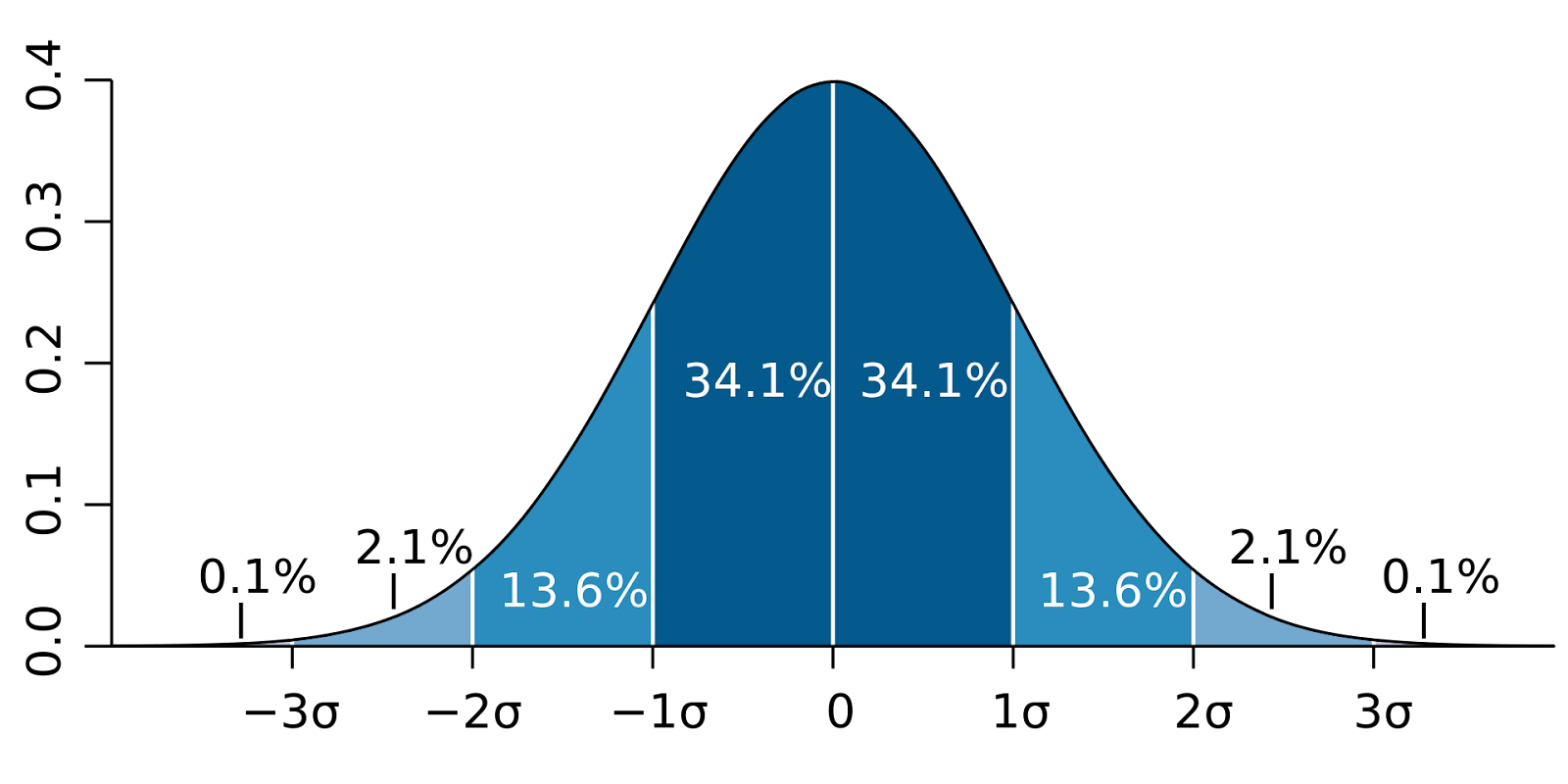
Wikipedia explains the standard deviation, represented by the symbol “σ” (sigma), “is a measure that is used to quantify the amount of variation or
dispersion of a set of data values,” and provides a very helpful graphic displaying 1st, 2nd and 3rd standard deviations on a plot of a normal distribution.
 |
| (By M. W. Toews - Own work, based (in concept) on figure by Jeremy Kemp, on 2005-02-09, CC BY 2.5, https://commons.wikimedia.org/w/index.php?curid=1903871) |
People who are well-acquainted with statistics might be able to anticipate the results of much of my analysis, and probably could use it to determine how the distribution of electricity demands differs from a standard distribution. For instance, the average percentage of hours where I find demand is below A - σ (the statistical mean less one standard deviation), in 13 electricity system hourly data sets, is 15.45%: in the diagram above of a standard distribution it’s 15.8%. That result should not surprise a statistician, but perhaps some other metrics I’ve collected will be - and if not I will attempt to present the analysis for those that those unfamiliar with statistics.
